Grids provide structure to UI/ UX design, helping users make sense of layouts. Grids are used throughout design, but they are especially important in UX and UI. They provide guidance and layout support for page design as they respond to different screen sizes.
They also provide a structure for layouts, allowing designers to keep page layouts consistent and support collaboration between designers and developers.
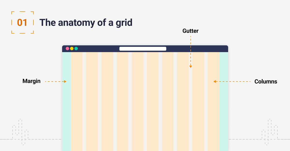
1. The anatomy of a grid
Grids are made up of three elements: columns, gutters and margins.
Columns: content is placed within the columns in a grid. In responsive layouts, the columns will be represented by percentages allowing the layout to adapt to the screen size the user is viewing from.
Gutters: a gutter or padding is the space between the columns. They use fixed widths but these can change as the breakpoints of the page change. A breakpoint is the point at which a website will adjust the way its content is displayed to optimise the user’s experience.
Margins: these are the spaces to the left and right off the screen. These margins can adapt depending on the screen size: on a larger screen size you would look to use a larger margin to give the design more space to breathe.

2. Common types of grid
Modular grid: these grids are a combination of rows and columns. YouTube is a good example of a modular layout.
Column Grid: these grids are based on vertical blocks that depict the width of the content on a website. Columns normally change in number as a page reacts to different breakpoints.
Hierarchical grid: in this example, the content is organised in blocks that allow you to prioritise design elements by order of importance.

3. Placing content
Gutters are used to create space between each block of content. Do not place content in the gutters, as content should align to the edges of the columns they cover.
Your main content areas should be aligned like this, but you should not align every single element as this may compromise your design.

4. Common screen sizes
The most common screen resolutions in pixels are as follows:
- Large (desktop): 1440×1024
- Medium (tablet): 768×1024
- Small (mobile): 320×640
Consider this when setting up your grids and optimise how your users are using these screen sizes. Be aware that screen resolutions should be considered quite fluid as the device is not necessarily linked to the size.

5. Adapting the grid
A breakpoint is the point at which a website’s content and design will adapt in a certain way to provide the best possible user experience. Breakpoints should be optimised to support things like navigation and content consumption on mobile devices.

6. Breaking the grid
It can be OK to break the grid in some instances, for example, if you want to make an element of the design stand out.

Conclusion
The benefits of a grid support designers, developers and users. The grid structure should be one of the first things to consider when creating a UI design.
Have a call
We’d love to talk to you about how Make it Clear can support your organisation. Book a call here.

