UI style guides
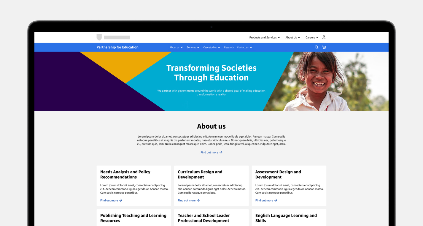
A style guide serves as a roadmap, delineating the branding principles and elements essential for maintaining consistency and coherence across various digital products. It functions as a repository of rules and instructions that govern not only the visual aesthetics but also the overall user experience. From the selection of colour palettes and typography to the placement of logos and imagery, every aspect of the digital product’s appearance and behaviour is outlined within the style guide. Through this guidance, designers and developers ensure that each product adheres faithfully to the overarching design language, fostering a seamless experience for users across different platforms and devices. The style guide embodies the brand’s identity while serving as a blueprint for crafting compelling and cohesive digital experiences.
A style guide provides design teams and front-end developers with a single source of truth where they can reference design patterns, guidelines and elements to ensure the addition of new components or features is consistent. The more mature a style guide is, the more efficient it will make the design process moving forward, enabling teams to quickly create realistic mockups using the pre-existing elements and modules for user testing.
Introduction to style guides
There are certain topics that a style guide should provide context around. A well-structured style guide includes the following:
1. Visual elements
This section outlines the design elements, such as colour palettes, typography, iconography, and imagery guidelines. It specifies the exact colours to be used, font choices, sizes, and how to create and use icons and images consistently across the product. The design elements needed are project-dependent but typically consist of:
- Accordion
- Banners
- Breadcrumbs
- Cards
- Colour
- Forms and filtration
- Iconography
- Links
- Navigation
- Tags
- Typography
NB. When creating a style guide it is vital to link all design elements to local styles and variables on Figma. This will help save time and effort when building designs, maintaining consistency, managing design systems, and creating complex prototyping flows.
2. Layout, grid and responsive design
The style guide defines the layout principles, grid system, and breakpoints to be followed, ensuring that the interface components are arranged consistently, aligned correctly and responsive.
Breakpoints are specific screen sizes at which the layout of your website will change and are the building blocks of responsive design. Grid principles help designers align objects within a frame and ensure designs remain logical and consistent across different platforms and devices.
For the majority of projects, there are four breakpoint sizes that need to be defined and grids created for. These are small (phone), Medium (phone/tablet), Large (tablet/laptop) and X-large (laptop/desktop).
When defining grids you must specify the following:
- Responsive or fixed
- Number of columns
- Column width
- Gutter size
- Margin size
Once grid properties have been defined, these can then be saved as styles.
The standard screen sizes to design on are:
- 360px / Mobile
- 768px / Tablet portrait
- 1024 / Tablet horizontal
- 1920px / Desktop
3. Components
Components are elements you can reuse across your designs. They help to create and manage consistent designs across projects. You can create components from any layers or objects you’ve designed. The components needed are project-dependent but typically consist of:
- Banners
- Buttons
- Cards
- Checkboxes
- Form fields
- Iconography
- Search
- Tables
- Tooltips
- Navigation
4. Interactions, states and animations
This part covers the guidelines for micro-interactions, animations, transitions and element states. Once defined these create a smooth and cohesive user experience.
Common animations can include:
- Loading states
- Graph animations
- Swipe animations
- Notifications
Key states include:
- Default
- Hover
- Pressed
- Focused
- Disabled
5. Local styles and variables
Creating local styles and variables will help you simplify your workflow, keep designs consistent and save time. Styles and variables should be created as you are creating the designs. Key styles and variables to set up are:
- Typography
- Colour
- Spacing values
- Viewport sizes
- Iconography
6. Accessibility guidelines
The style guide may include information on making the product accessible to users with disabilities, following accessibility standards and best practices. Accessibility should be considered throughout the whole design process. It is vital to make all designs as accessible as possible, key areas to consider are:
- Colour contrast
- Accessible fonts
- Line length
- Text
- Iconography
- Video and media
7. Writing guidelines
The style guide may include information on making the product accessible to users with disabilities, following accessibility standards and best practices.
8. Versioning and updates
A good style guide is dynamic and evolves over time. Ideally, one person who was involved in the build would be in control of management and updates, keeping the design consistent with additional designs and changing needs.
What are style guides, and why are they important?
A style guide is a comprehensive set of guidelines and standards that define the visual and interactive elements of a digital product. A style guide is a smaller and less detailed version of a design system; it can often be a ‘subclass’ in an overarching design system. It exists as a set of branding rules that guide how products that live within an overarching design system should look and feel. They often have slightly different design elements, such as typography, colour and iconography.
The role of style guides
A style guide serves as a single source of truth for design and development teams to ensure consistency and coherence throughout the user interface (UI) and user experience (UX) of a product or application.
Benefits of style guides
Style guides ultimately provide design teams with the relevant information, components and guidance which allow prototypes or new features to be developed faster, in the correct branding style and with fewer complications.
Supporting your users' needs

Visual design consistency

Values and principles

Enable efficient cross-functional collaboration
What’s included
When creating a style guide, we follow atomic design principles to build out core principles, visual elements, grids and layout, components, interactive states, styles, variations and usage guidance.
Why choose Make it Clear
At Make it Clear, we take an evidence-based approach to everything we do. Understanding your organisation, audiences, and the context in which they interact is paramount to the way we work and deliver a best-in-class user experience.
Why not consider supporting your UX and UI requirements with a design retainer?
A design retainer is a contractual agreement between Make it Clear and your company, ensuring access to our design services over a designated period. This arrangement offers a streamlined and cost-effective solution tailored to consistently meet your needs. Discover more about our design retainer services on our dedicated page.