Mobile user experience design (UX) is the creation of positive and engaging experiences when using mobile devices. With over 6.6 billion smartphone users in the world, spending on average four hours a day on their phones – providing an experience that delights and informs the users is more important than ever.
1. Thumb position
Thumb friendly navigational design describes the area on a mobile device where the thumb is most at ease when interacting with the screen. Important links should be placed within easy to reach zones, with the aim of designing key calls to actions that sit within these zones.

2. Touch areas
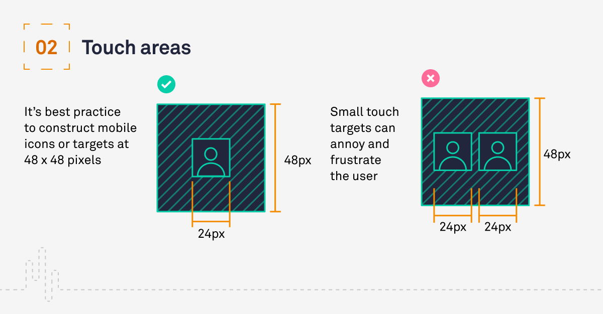
The touch areas and control sizes of a mobile device must work with the reach and dexterity of the user’s thumb. Small touch targets can annoy and frustrate the user so one must consider and design targets that are big enough for users to easily tap.
It’s best practice to construct mobile icons or targets at 48 x 48 pixels, this allows the thumb or finger to fit nicely within the icon.

3. Font sizes
Fonts are integral to the visual identity and personality of a digital interface, while providing clear readability at the same time. When designing for mobile, it’s important to consider smaller screen sizes and to therefore use a larger font so the user can easily read and digest the content.
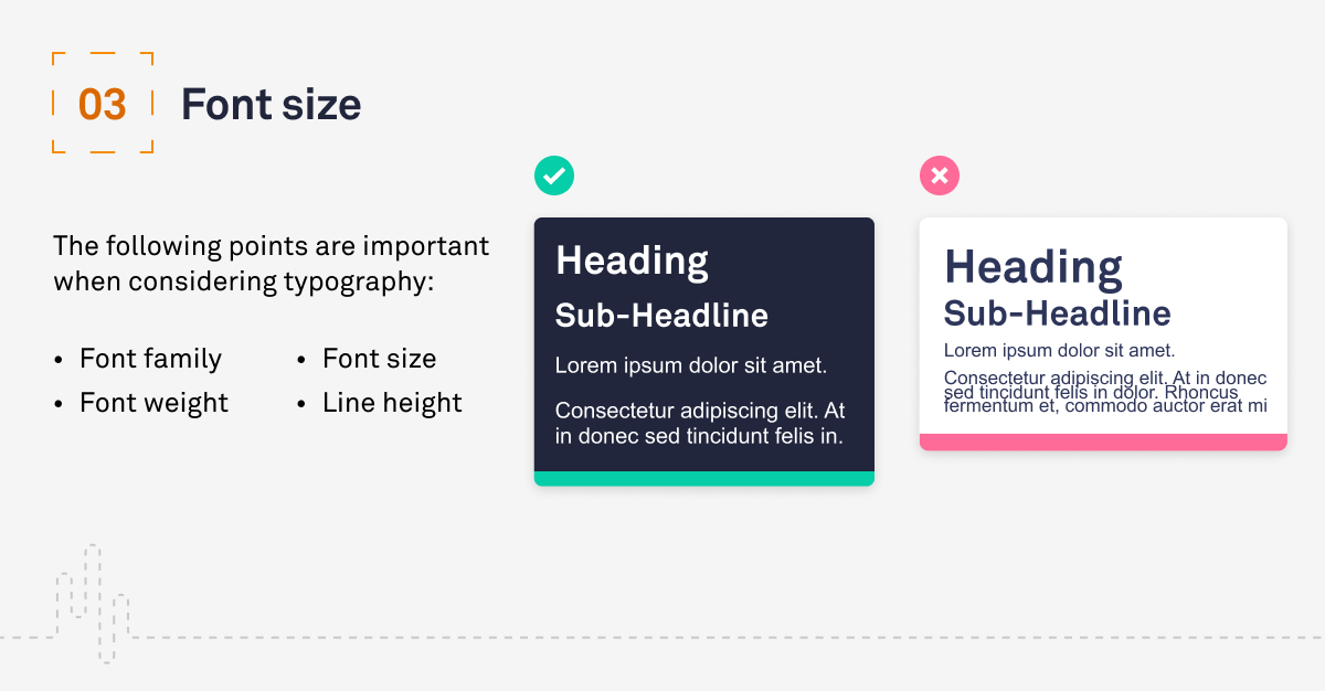
It’s best practice to have your font size no less than 12 points and the recommended size is 16, this ensures the user can read the content without zooming in or adjusting the distance of the device.
The following points are important to considering typography:
- Font family
- Font weight
- Font size
- Line height

4. Navigation
Simple to understand and clear navigation panels allows the user to move between screens and areas of the platform in an intuitive and easy to understand manner.
Navigation panels should be clean and minimal with common patterns used throughout and icons that are familiar. Considered information architecture creates a structure which acts as a skeleton for the platform, allowing users to search for and discover specific items.

5. Real estate consideration
The proportion, layout and use of white space is key to creating a visually coherent and engaging mobile interface design. A smaller screen doesn’t mean you should reduce the amount, size or quality of content.
Reduce clutter, increase line heights and element spacing as well as clever use of white space are all valuable tools for creating an elegant and informative user interface design.

Conclusion
The importance of UX design for mobile devices has become more poignant than ever as they play a more active role in modern day life. To make an impact on users, designers must consider the key UX principles as outlined in this blog to create engaging and educational experiences which delights the user and helps reach business goals.
Have a call
We’d love to talk to you about how Make it Clear can support your organisation. Book a call here.

