A year ago this month I joined Make it Clear as its new Creative Director. After I’d been warmly welcomed into the team, familiarised myself with studio life and learned a new software programme (or two); I was tasked with the job of leading the creative for our very own rebrand.
What could be simpler? You’re a designer with years of experience, it’s a creative agency, you do this sort of thing everyday. However, as any designer who has a similar story to tell, branding yourself is rarely that straightforward. Often you’re too close, there can be a multitude of ideas floating around or sometimes none at all. Then there’s the pressure; it’s easy to put on yourself – to come up with something no other agency in the world has ever done before. This can feel exhausting – and is frankly unrealistic.
That’s when you remember to trust your instincts, and approach it like you would any normal branding project. From that moment, good things begin to formulate in your mind, down through your pen and onto the page. A few months later, here I am writing a blog about what we came up with and why.
Three little words
‘Bold’, ‘Confident’ and ‘Simple’, were the design team’s mantra during the project. A review of the existing brand led us to the realisation that what we were using lacked simplicity.Elements had been added over time and as a result it didn’t look as single-minded as it could; we needed to cool things down.
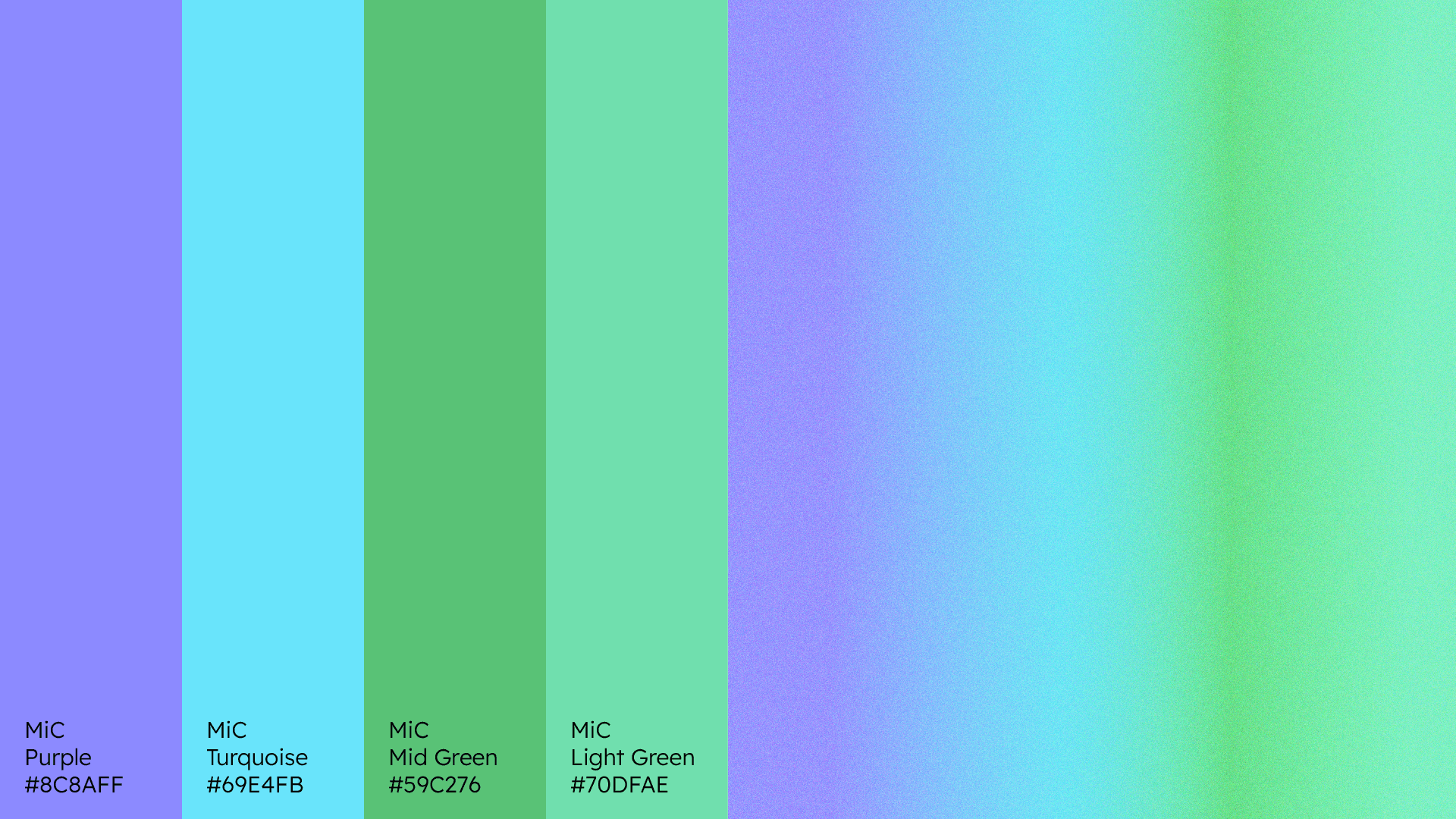
The first port of call was colour – the existing palette required freshening up. Being new to the agency, I was made aware that blue had a long association with Make it Clear. This gave us the clue to forming a new palette. A blue was retained and extended on opposite sides of the spectrum towards purple and green. As well as working individually, all four colours combine to create an ever changing linear blend that ebbs and flows, much like the ideas forming in our heads. These colours live alongside black and white to allow for clarity of communication throughout – or to use three little words – make it clear.
What’s in a name?
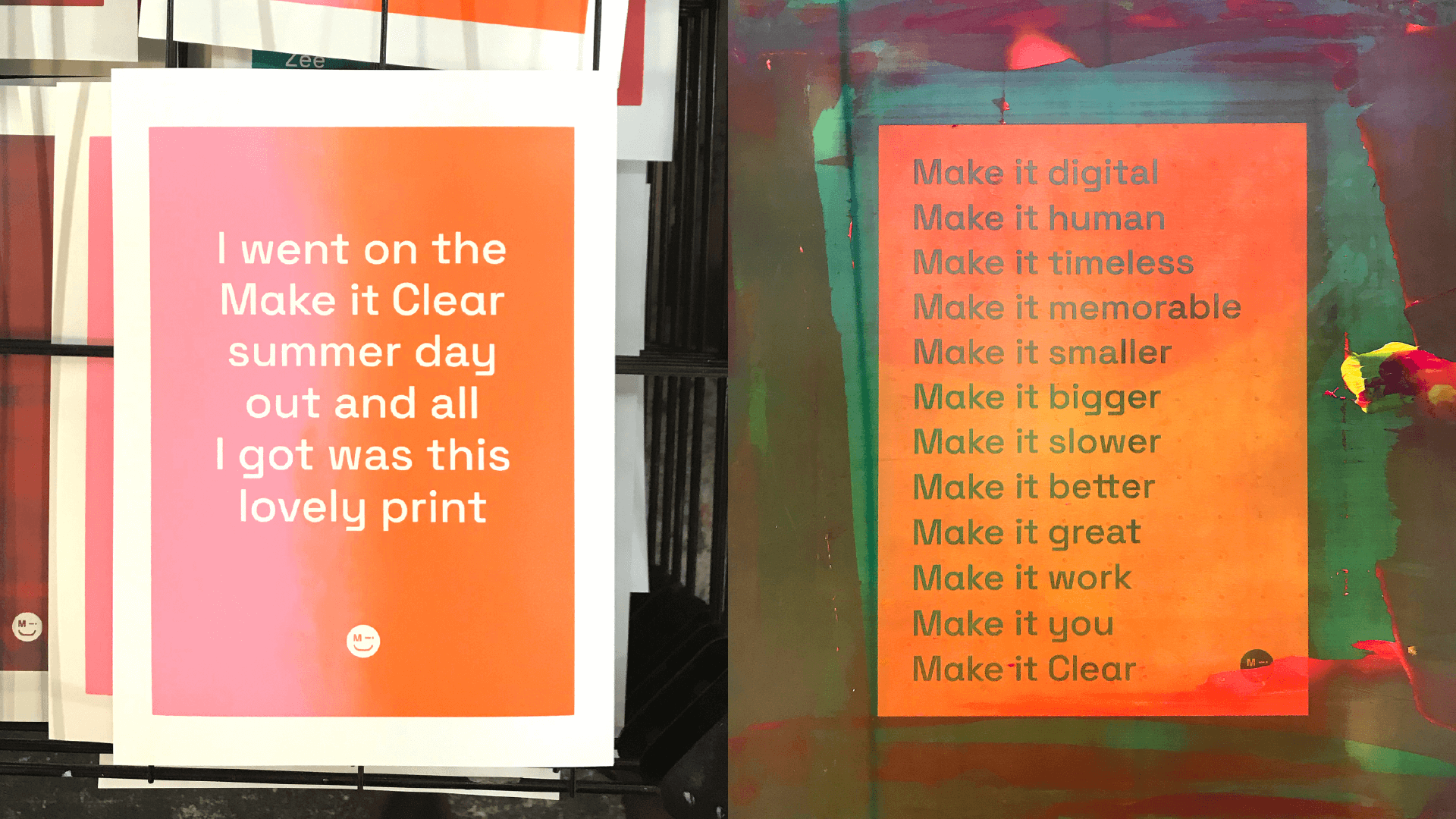
To be honest, quite a bit. As our name states, we literally make it clear. In a nutshell, we provide simple human solutions to complex digital problems. But what else? Well, we also make it better, make it memorable, make it you, the list is endless. This linguistic serendipity was too good to turn down.
Any strong brand has legs, and this idea can run and run (and run) – as we discovered on a recent team day out to screen print posters using this play on words. The use of wit can elevate any brand and add that all important personality to help you stand out from the crowd. It’s an approach we like to consider as part of any project.
We’re the accessible type
We talk a lot to our clients about accessibility and the importance of it. This can range from colour contrast to website navigation, and more often than not includes a conversation around typography. As we reflected on our existing brand it became apparent that we weren’t always practising what we preached. How could we improve?
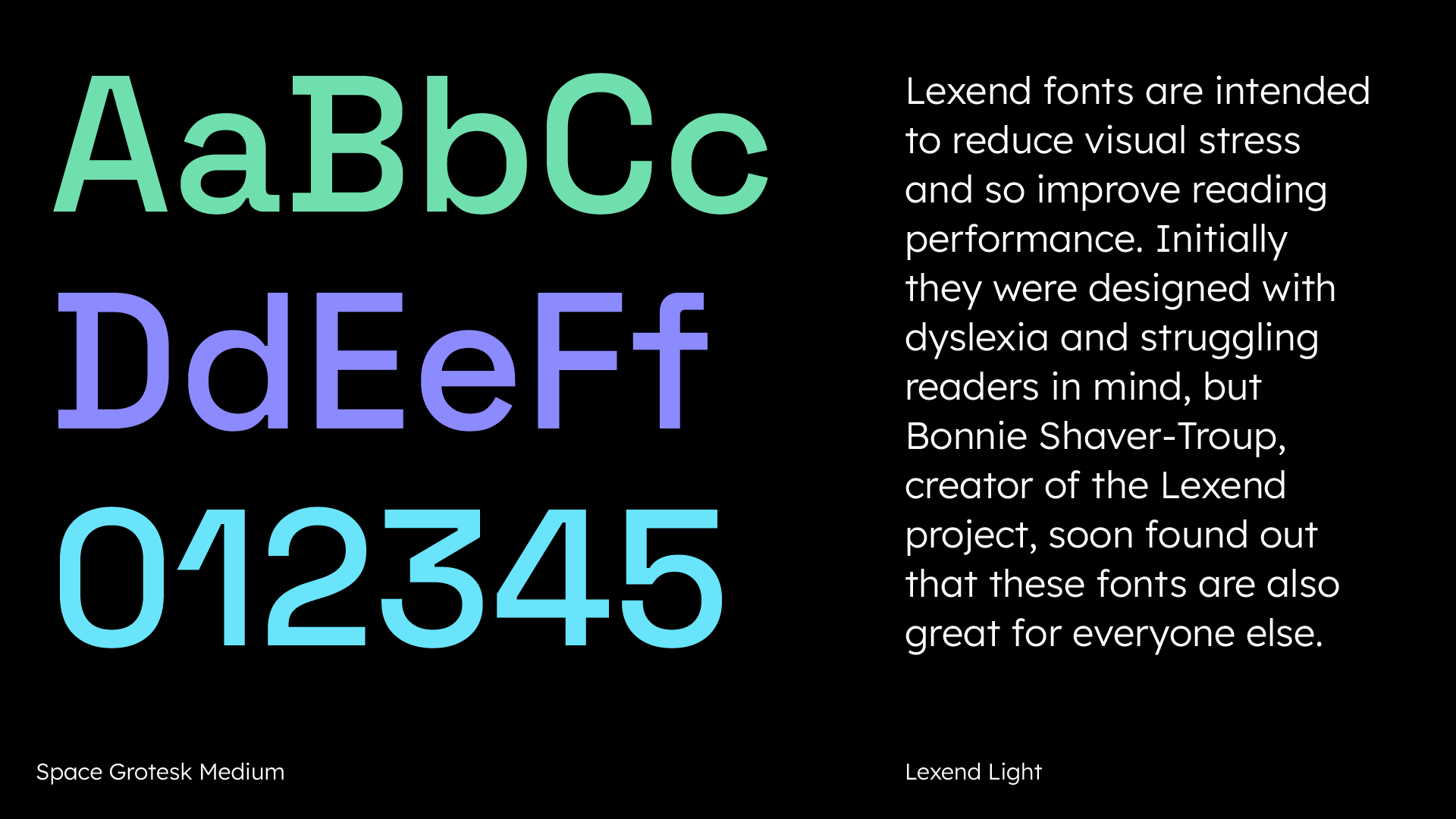
The first item on the list was, yes you’ve guessed it, typography. We did a lot of research into what makes a typeface more accessible and learned it’s about unique letterforms, idiosyncrasies and open counters (i.e nothing too closed up). This led us to selecting two Google fonts with many of these characteristics (available to all users – another important aspect of accessibility). These are the distinctive ‘Space Grotesk’ for headlines and the legible ‘Lexend’ for body copy. The result is a typographic approach that works whether big or small on any of our colours – and all above the 4.5:1 ratio.
Make it iconic
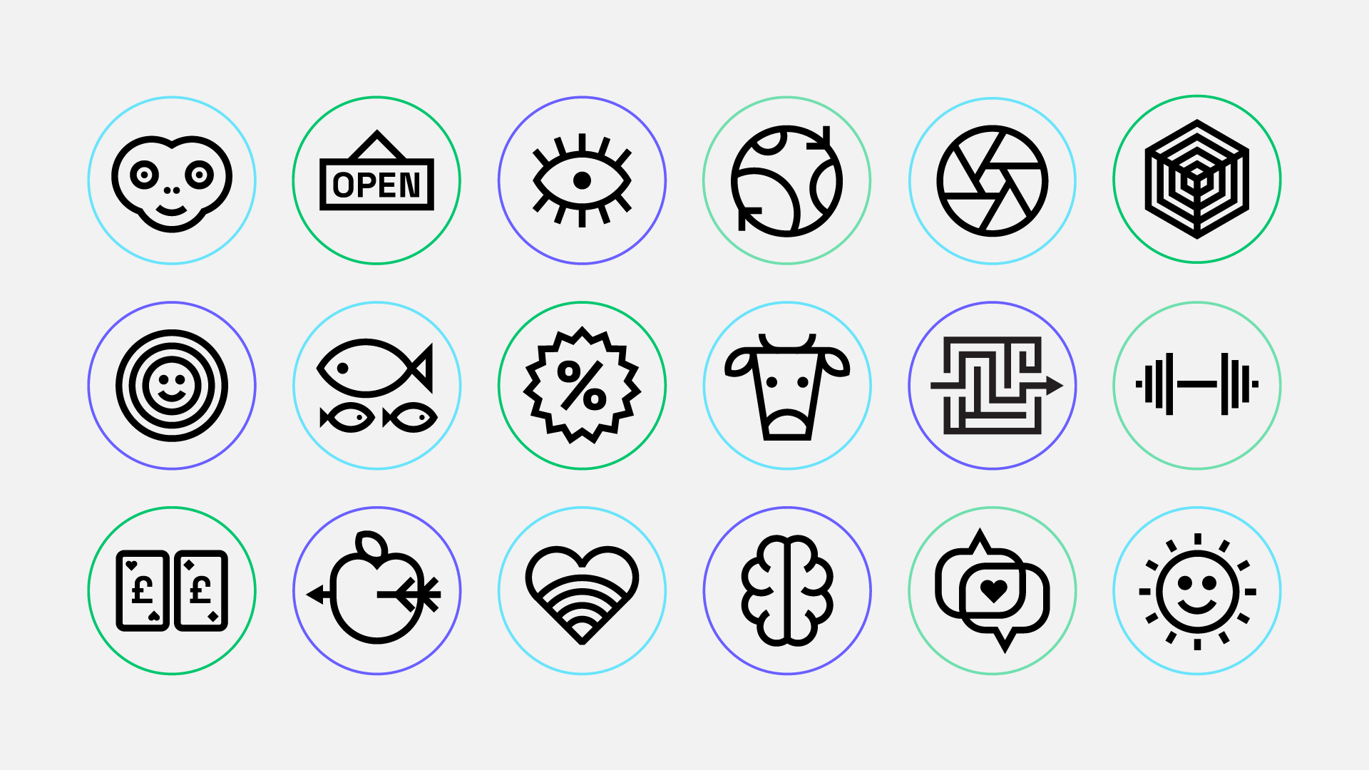
As a multi-skilled creative agency, we have a lot of strings to our bow, but writing about these strings can be time consuming. Given that ‘a picture can paint a thousand words’ we decided to use this adage to create a suite of 80+ unique icons to support our storytelling. Each is drawn using a single stroke with an eye on symmetry. As the famous graphic designer Abram Games once said – ‘maximum meaning, minimum means’.
Don’t forget to smile
As the project came towards its culmination there was a nagging feeling that it needed a touch more warmth. A seemingly throwaway idea, something to ‘make it memorable’. That’s when we came up with ‘MiC’, our smiley-faced character. Created from the first letters of our logo, it succinctly sums us up as an agency and also makes a great pin badge.
The moral of the story is it’s never too late for a good idea.
If you’d like to see what ideas we can bring to your design project (and get a badge), drop us a line and let’s start talking!

