In this article, I have unpacked some basics around colour theory and, in particular, UI and UX colour theory. Colour is an incredibly powerful tool. In some cases, it can be associated with physical reactions such as increased blood pressure.
Below we are looking to explore aspects of colour theory, including psychology and cultural differences. For screen design, we use RGB colour. Colours are displayed by combining RED, GREEN, and BLUE light. For UI design, we code our colours using hexadecimal values. Colours are specified with codes between 00 and FF. These specify the intensity of the colour.
1. Colour terminology
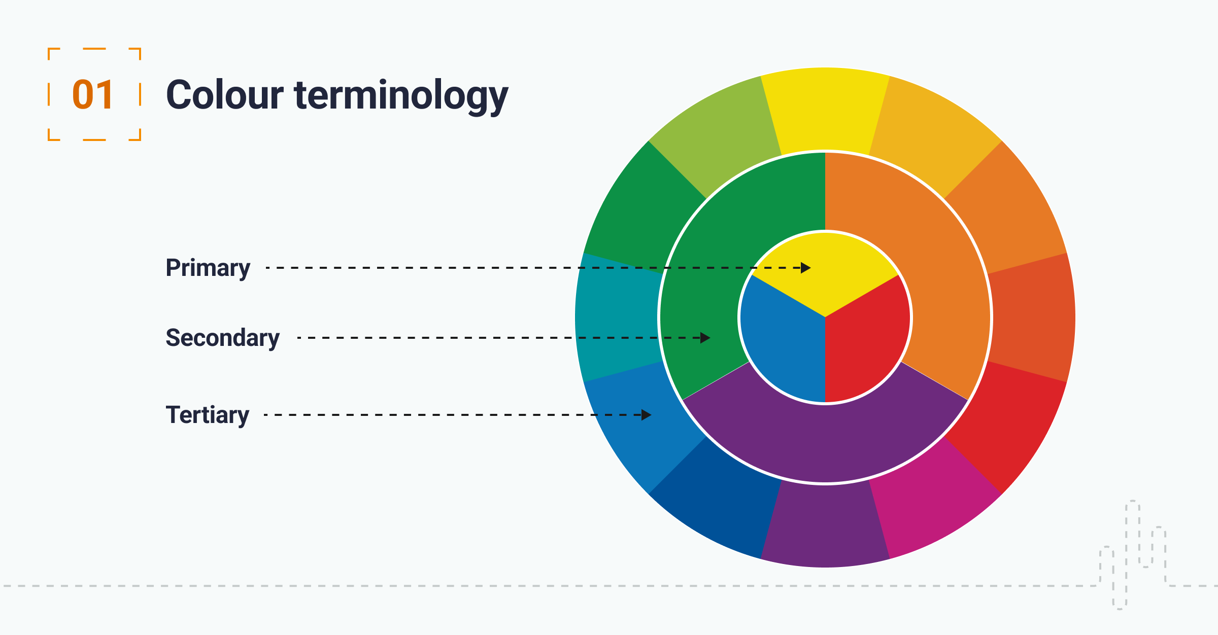
To begin, I have looked to explore some of the terminologies you may come across when working with colour:
RGB: Colours used for screen design; these colours are displayed by combining RED, GREEN, and BLUE light
CMYK: Refers to colours used in printing cyan, magenta, yellow, and key (black). Be careful not to create any screen designs that use CMYK. You will find that some colours will look dull; this is because CMYK uses ink to create colours, and RGB used light.
Primary colours: These are colours that can be combined to make other colours.
Tertiary colours: A tertiary colour or intermediate colour is a colour made by mixing the full saturation of one primary colour with half saturation of another primary colour.
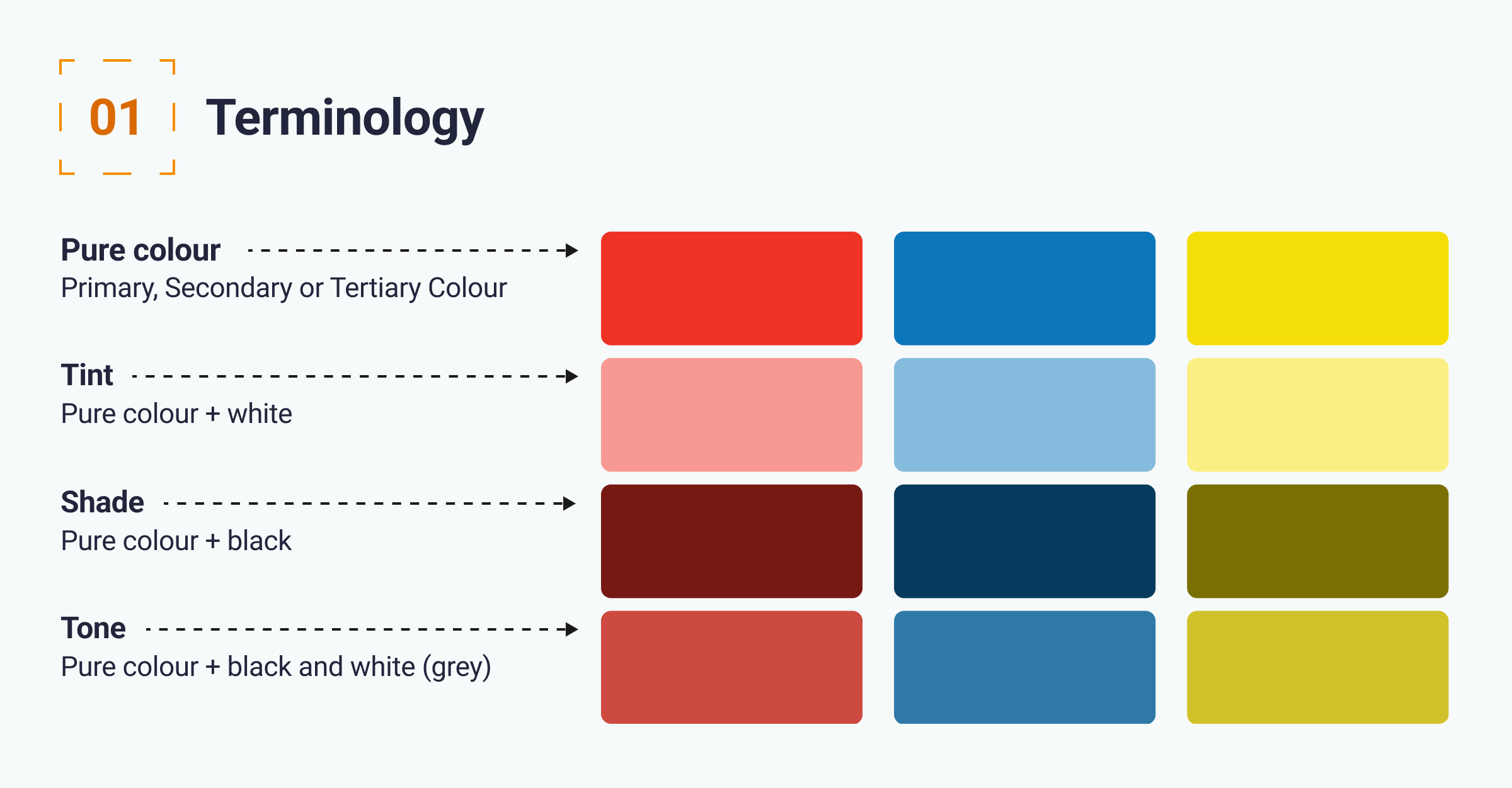
Pure colour: This refers to primary, secondary and tertiary colours.
Tint: A tint is a pure colour with white added.
Shade: A shade is a pure colour with black added.
Tone: A shade is a pure colour with grey added.
2. The psychology of colour
Colour psychology is the study of how certain colours can impact upon human behaviour. When designing digital products and services, it’s critically important to consider the emotions users may associate with certain colours. For example, red is associated with a warning or danger due to its colour relating to the colour of blood. Other colours can be more subjective and may only have an emotional significance to a certain type of user.
The chart below outlines some examples of this:

3. Cultural differences in colour
As I have mentioned, colour is a powerful tool and will be perceived differently by different user groups. An important consideration is around how different cultures interpret data, a good example is the colour red; in Western culture, this can be an indicator of danger, but in Indian culture, it can meet beauty or wealth.
I have created the chart below to highlight some differences:

4. The 60-30-10 rule
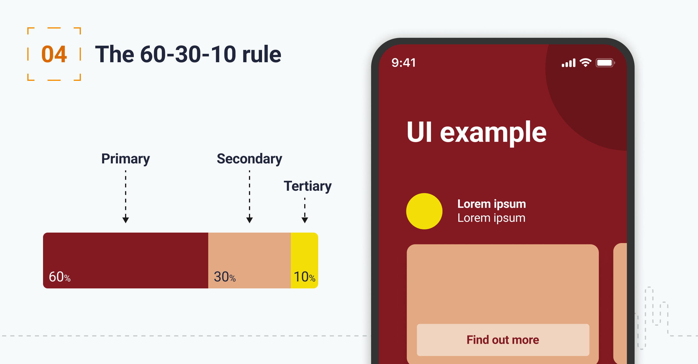
The rule is pretty simple and will help create balance in your designs. 60% of the design should use the dominant colour, 30% should use the secondary colour, and an accent colour of 10% should be used.
Accent colours are often the most powerful of the three and can be used to highlight key UI elements such as primary style buttons, links, and section headings.
5. Accessibility and colour
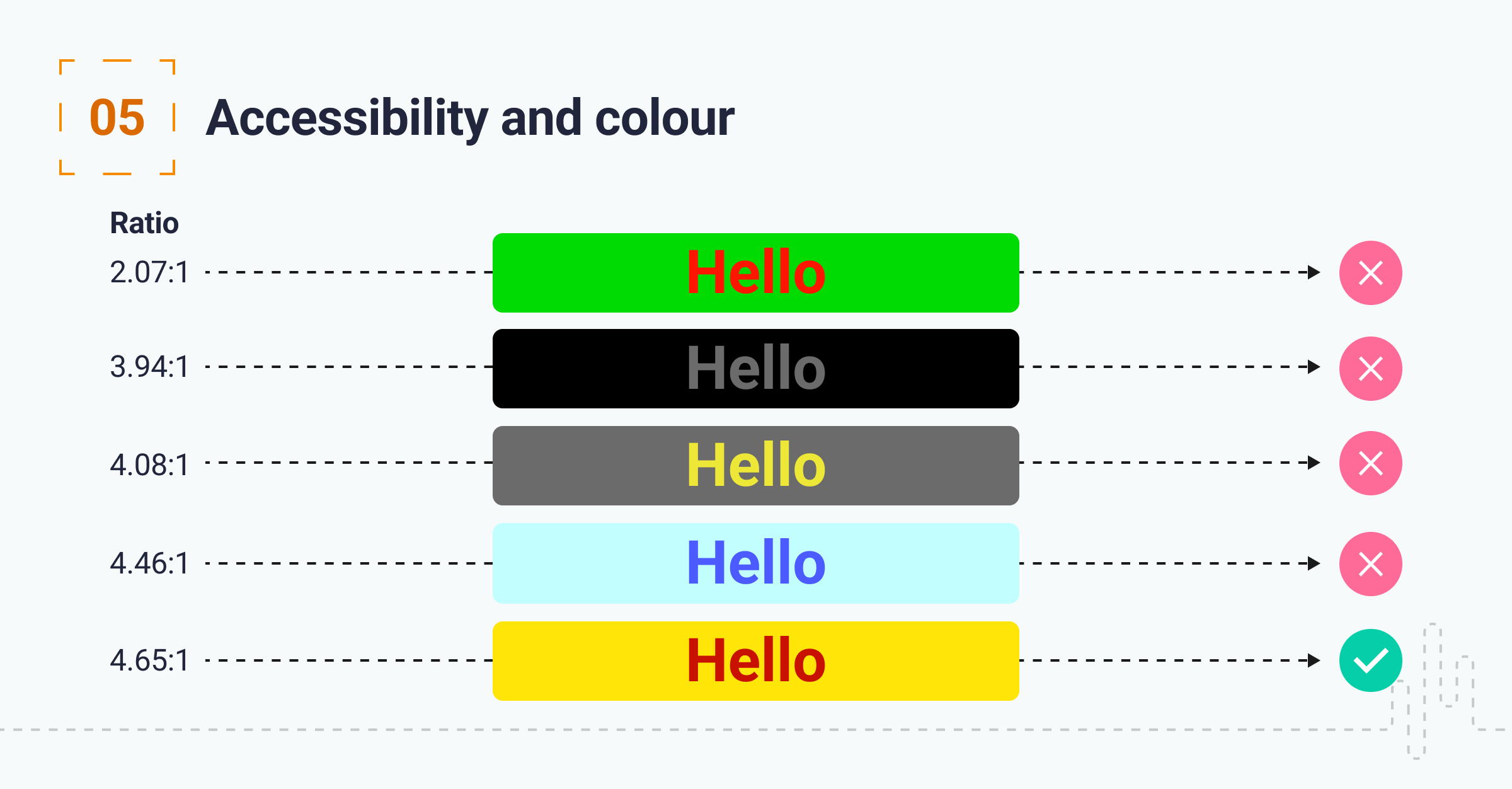
There are a number of accessibility points to consider when selecting and using colours. Firstly ensure that your background-to-text contrast ratio is at least 4.5:1 and meets the Web Content Accessibility Guidelines (WCAG).
The second area of consideration is colour blindness or colour vision deficiency (CVD). 1 in 12 men and 1 in 200 women are colour-blind. Pilestone has a handy feature that allows you to upload images and simulate how they would be viewed by someone with colour blindness https://pilestone.com/pages/color-blindness-simulator-1
Don’t use colour alone to indicate meaning, ensure you are pairing UI elements with text or supporting icons.
6. Practical tips on using colour
Before I conclude, I have gathered a few additional points:
Create visual hierarchy: Some colours get the user’s attention more than others, and using strongly contrasting colours can also assist in creating a hierarchy with colour.
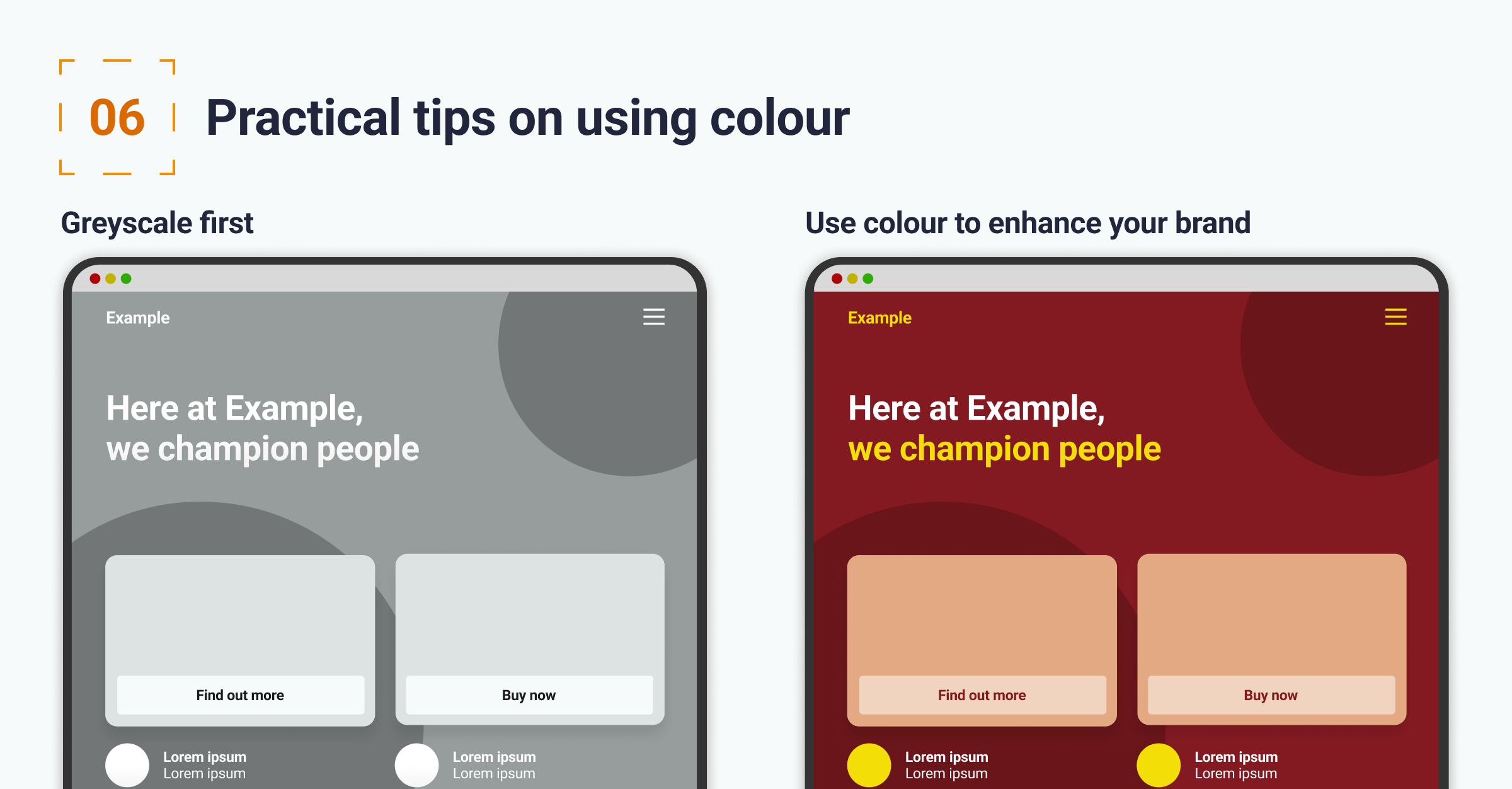
Grayscale first: It is always best to design using grayscale first; doing this stops colour from becoming a distraction when initially testing UX principles such as wireframes. At this stage, you can still create emphasises in the design by using shades of grey (up to 50 :-).
Use colour to enhance your brand: Colour can be used incredibly effectively to both communicate the emotions of your brand (we call this brand expression). It’s also an effective way to ensure your brand is recognised and represented consistently.
Conclusion
Colour, when used appropriately, is a very powerful visual tool. This article has covered some of the basics of the areas of consideration. As you build out interfaces, you will gain experience of what works and what doesn’t.
If you need support, drop my company a line
We’d love to talk to you about how Make it Clear can support your organisation. Book a call here.

