Wikipedia describes Typography as ‘the art and technique of arranging type to make written language legible, readable and appealing when displayed’.
Typography is an art form dating back thousands of years; it helps convey information, provide emphasis and reinforces branding. When considering how typography is displayed online there are several unique considerations. In this article, I will look to unpack these.
Before we begin, an important point to bear in mind is that online users are not reading a novel when they are viewing your web pages or digital interfaces. They may often skim-read; they are on the lookout for a specific piece of content or interaction. Typography done well can not only support their needs but also enrich the experience.
1. Typography terminology
My background is in graphic design and the application of typography is a key component of any designer’s training, it’s also an area that is awash with specific terminology. In this first section, we will break down these terms.
Typeface: A typeface is a collection of lettering that includes variations in size, weight and shape, each of those variations is called a font.
Weight: The weight represents the thickness of a font, for example thin, regular or bold.
Size: There are many ways of representing size with online typography:
- Pixel (px)
- Point (pt)
- em: The font size is relative to the parent container’s font size.
- Root em (rem): when the font size inherits from the root of the styling
- Percentage (%)
- Viewport width or height (vw or vh)
Alignment: Text can have several alignment states. For example, this text is left aligned but it could be centred or right-aligned. Justified text is aligned with both margins.
Kerning: The distance between individual letters or characters is known as kerneling. In contrast to tracking, which modifies the space between each letter of a word in equal increments, kerning is concerned with the aesthetics of type, producing legible text that is appealing to the eye.
Tracking: Adjusting tracking will increase or decrease the horizontal space across the entire word between letters.
Leading: This represents the distance between two baselines of text, the name leading comes from when the type was set in metal and strips of lead that were inserted between each row.
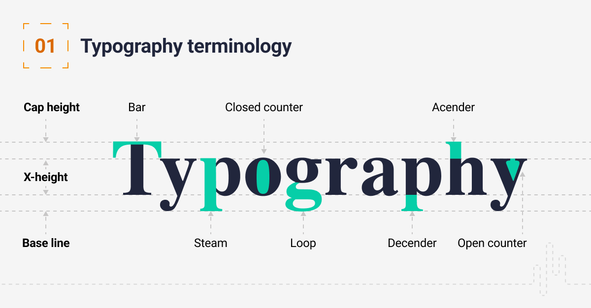
Serif and Sans-Serif: Serif fonts have tidy, stylised lines that extend off the letters, Sans-Serif fonts do not.

2. Hierarchy and scale
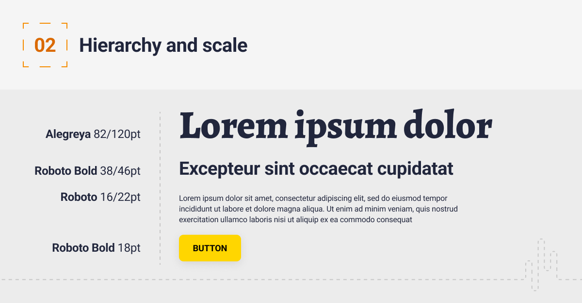
We create a hierarchy in our typography to help the user digest the information on a page. We should consider that our users will be skimming our pages and it’s our job to help them find the appropriate information quickly. The way we represent hierarchy is also important for SEO. Google reads headings to understand what the paragraphs that follow the headings are about.
When setting up your scale, start with the size that you will use most often (body copy). It’s best practice to make this between 16px and 18px. Then set a scale around this that allows you to create hierarchy and consistency in your design. Make sure you test your scales on multiple devices.
3. Colour and contrast
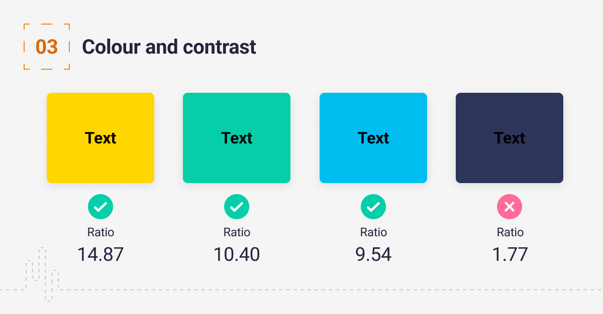
Ensure your typography has sufficient contrast. You should aim for the WCAG Level AAA, you can read more about the WCAG standards here.
The colour of the typeface should contrast clearly with the background, passing accessibility tests. Each character, word, or paragraph must be able to be read immediately and without effort. You can use a colour checker such as this to check your designs.
4. Line length and spacing
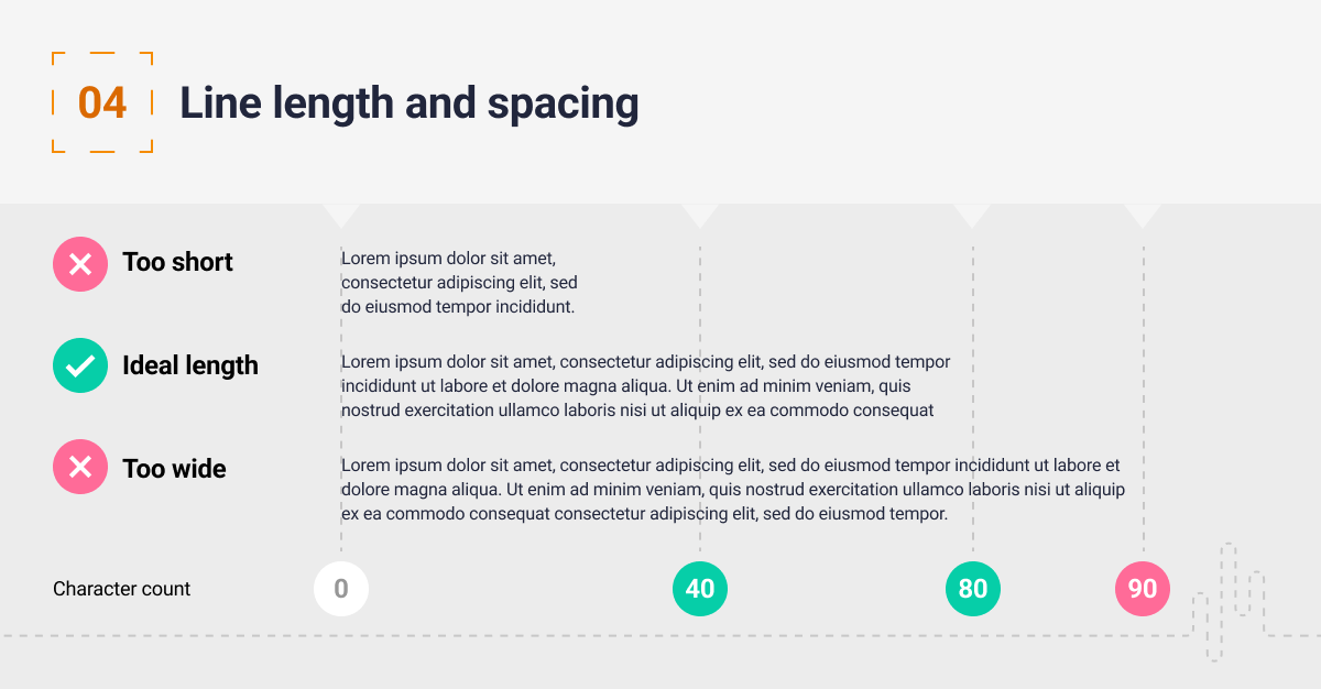
Getting the spacing correct on your site will improve the readability and overall aesthetic of the page, it allows users to focus on the important information. We use tracking to adjust the vertical spacing, a rule I like to use is to test a word with descenders like a ‘y’ and another word with an ascender, for example, an ‘h’ or a capital letter and ensure they don’t touch.
The width of the text block is also very important, long lines of text are difficult to read. It’s recommended that the optimal line length for body text is 50–75 characters. The Web Accessibility Initiative (WCAG) guidelines reference that lines of text should be 80 or fewer characters.
5. Use standard fonts
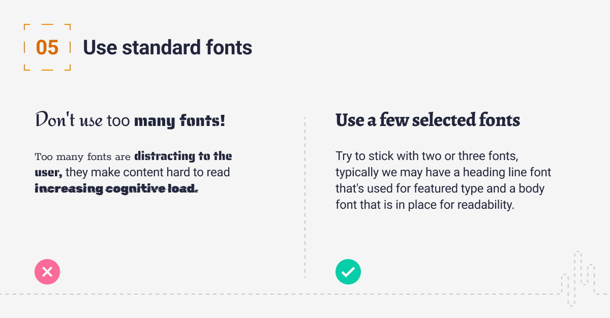
These days you can use any font on a website, but you need to be mindful of the type of font licence your font has. Not all fonts are free to use. Even though you can use as many fonts as you like, that doesn’t mean you should. Using too many fonts can be distracting for users. Try to stick with two or three fonts, typically we may have a heading line font that’s used for featured type and a body font that is in place for readability. Try and use standard fonts, very decorative fonts can be very hard to read.
Below are a few websites you can source fonts from, and even better these sites are all free:
Google fonts: Google fonts have one of the largest selections of free fonts online.
UrbanFonts: Another great resource, it has over 8,000 freeware fonts available.
Font Squirrel: Font Squirrel, compiles fonts from other websites and links out to them.
6. Creating type scales to support multiple devices
You must create a type scale that responds to different screen sizes. Start by selecting the font you would like to work with then establish the most commonly used type scale for the body copy, which is normally 16pt.
You can then define a scale: typical scales are 1.250x,1.414x, 1.5x, and 1.618x. Sites such as Modular Scale and Type Scale can help you do this.
Make sure you test your scale on multiple devices to ensure the scales are working.

Typography, language, aesthetics and implementation are a vast array of subjects. I have looked to cover some key points above, here are a few additional tips:
- Avoid uppercase; it can be hard to read and it also feels like you shouting at your user
- Avoid colouring text in red or green; if your colour blind these colours can be interpreted as the same thing
- You should use typefaces that complement and contrast with one another
- As always, test with real users
Conclusion
Thanks for reading, if you’re interested in what to consider when designing for on-screen reading, do read our previous article on the subject here.
Have a call
We’d love to talk to you about how Make it Clear can support your organisation. Book a call here.

