Forms are a common element of digital design and can support simple tasks such as signing up to a newsletter all the way to complex forms with multiple sections. There are principles that should be implemented for forms of all lengths. In this article we have outlined six key areas to consider when creating digital forms.
1. The anatomy of a form input field
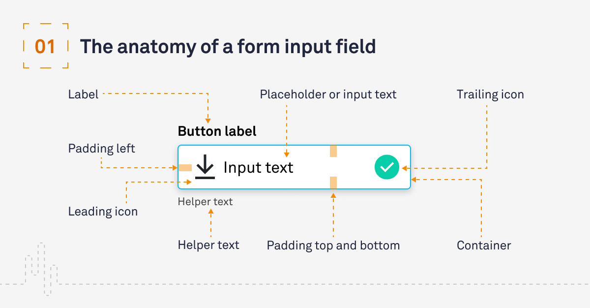
To kick off we are going to look at the anatomy of a form field. A form consists of numerous fields, which allow you to collect data that is input from your users. There are multiple types of fields but at a basic level you will find:
- Label: the descriptor of what the intention of the form is
- Container: the bounding area of the form field
- Placeholder/Input text: placeholder text is used to help the user before actual text is input; it should not replace the label
- Leading icon (optional): this is often used to indicate the purpose or functionality of a field
- Trailing icon (optional): this is often used to indicate an error in the form or confirm everything is correct
- Helper text (optional)
- Padding top and bottom
- Padding left

2. Typical types of form field
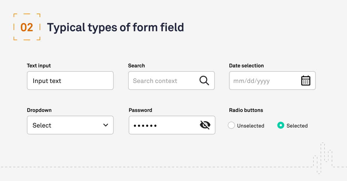
There are multiple types of form field that can be deployed. We have included six of our favourites below, but for a more exhaustive list take a look at our UX Glossary.
- Text input: Typically, these will include a label; the size of the container should reflect the length of the input by the user that is expected.
- Search: These inputs should be in an obvious location for the user to find, so make the input forms visible and use placeholder text to give the user context on what they can search.
- Date selection: The inputs can be supported by a date picker if the date required is close to the present time.
- Dropdown: The most common form of a picker, the dropdown is an interactive UI element that allows a user to select a single option from a predefined list.
- Password: These fields should hide the input by default but it is good practice to allow the user to see the number of characters they have input, usually by replacing each character with a symbol such as an asterisk (*) or a dot (•).
- Radio buttons: An interactive UI element that allows a user to choose one item from a predefined set of mutually exclusive options. Unlike a checkbox list, radio buttons don’t allow the selection of multiple answers.

3. States of form fields
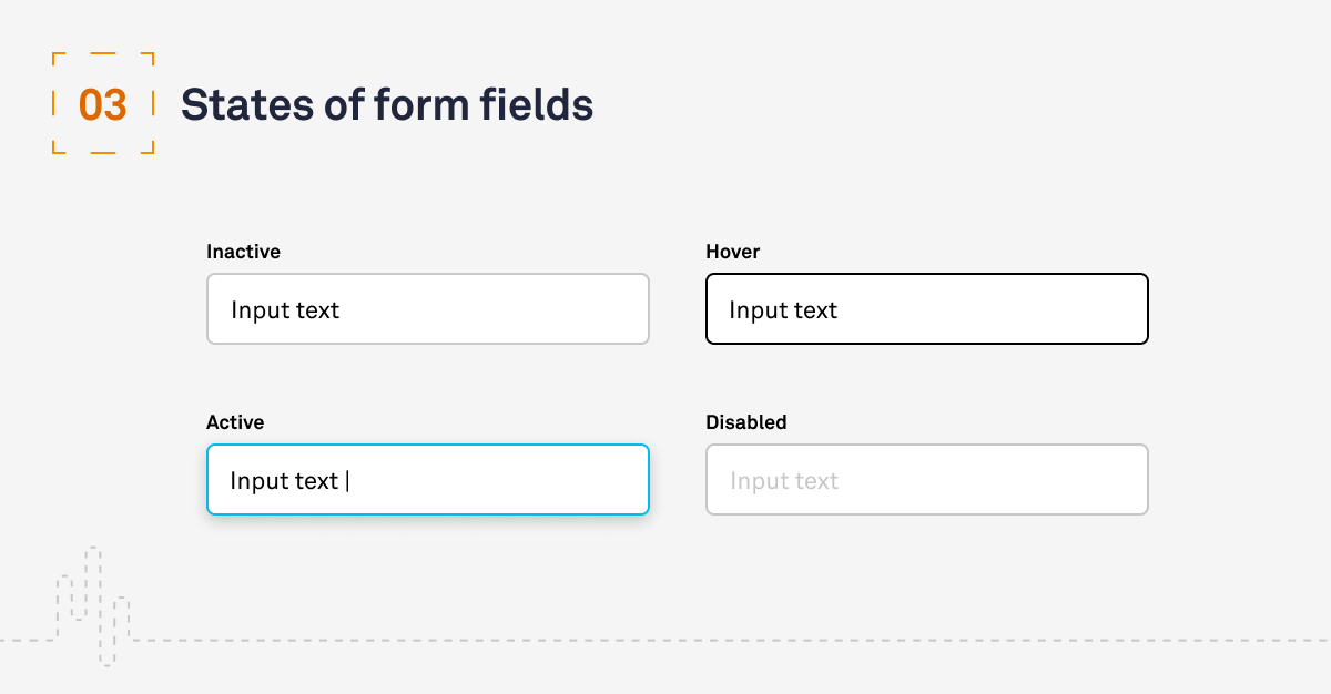
No 1 in Jakob Nielsen’s 10 general principles for interaction design references ‘Visibility of system status’. Because your design should keep users informed of what is going on, we need to consider the following states:
- Inactive: this field is ready and waiting for you to interact with it
- Hover: these are initiated by the user pausing over the field, and are used to indicate that the area is actionable
- Active: when the field is active and receiving input it should change state to indicate this; typically this would be a change to the container outline and with the introduction of a cursor
- Disabled: there are use cases where it is important that a user can see a field but they should not be able to change the data inside. This is a disabled state.

4. Use of labels
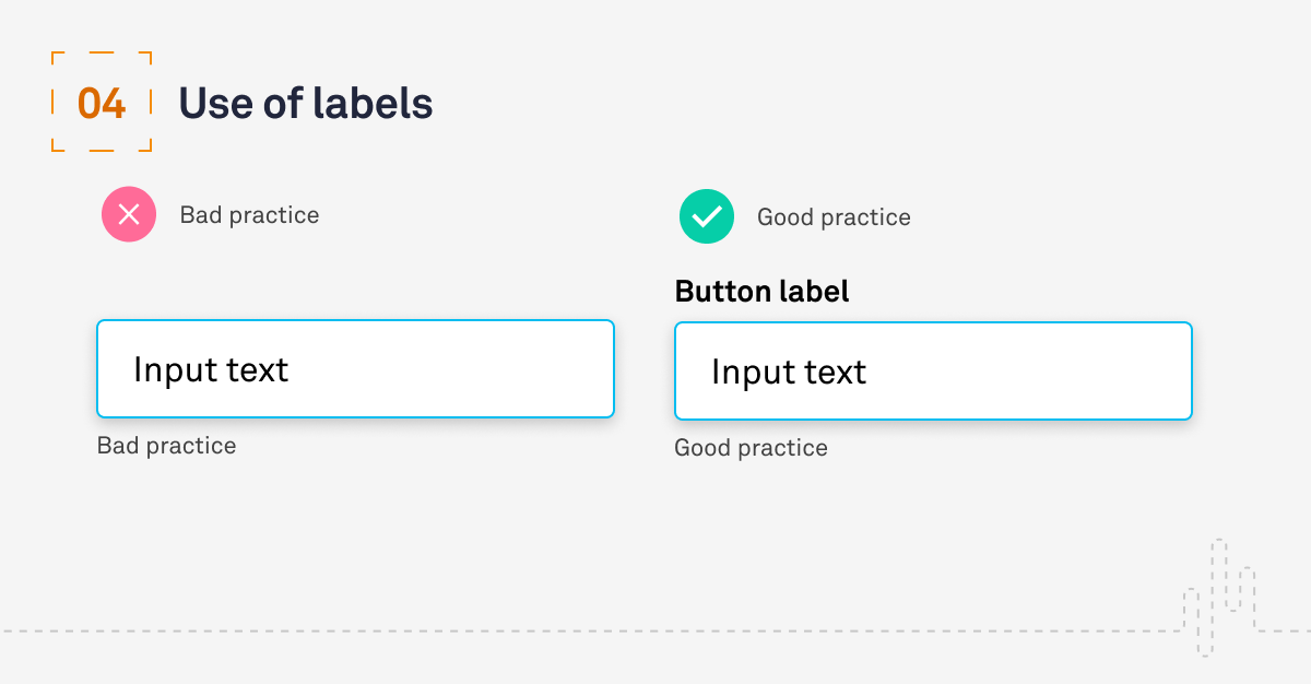
Every field you include should be given a label to indicate what the field is referencing. Luke Wroblewski recommends these best practices for label placement:
- For reduced completion times and familiar data input: top aligned
- For unfamiliar, or advanced data entry: left aligned
Top alignment is also good for multi-language support and as Matteo Penzo article on label placement confirms, they will support your user scanning and completing forms as quickly as possible. Labels also support accessibility, as screen readers will use them to provide context and without them forms may become inaccessible. Other best practices include:
- Don’t use placeholder text as a label; it disappears as soon as the use selects it and can often confuse a user
- Keep labels short and to the point
- Use sentence case, which has been proven as easier to read

5. Show errors inline
An inline error is a short message that informs a user that something is wrong with the form. They allow users to correct data as they progress down a form, so ideally they should also provide information on how to resolve the error. You should remove the error when the field is resubmitted.
It may also be relevant to indicate if a field has been completed successfully, for example when entering a code or password.

6. Forms should be one column
One-column layouts are easier for users to consume and prevent users skipping fields because their eyes are not scanning the content correctly.

Conclusion
This is an overview of some areas we find important. Other areas to consider are:
- Adapting forms to be optimised on mobile
- Omit unnecessary fields
- Include easy-to-complete information at the top of a form
- Grouping related fields
Poorly designed forms can fundamentally affect the experience your users have of your digital projects and services. Attention to detail will support your users’ understanding and help them complete their goals faster with minimum confusion.
Have a call
We’d love to talk to you about how Make it Clear can support your organisation. Book a call here.

