The button is one of the most used UI elements. They appear simple but there are a number of rules and principles that underpin effective and efficient design. In this article, we’ve outlined our five best practices for button design and implementation.
1. The anatomy of a button
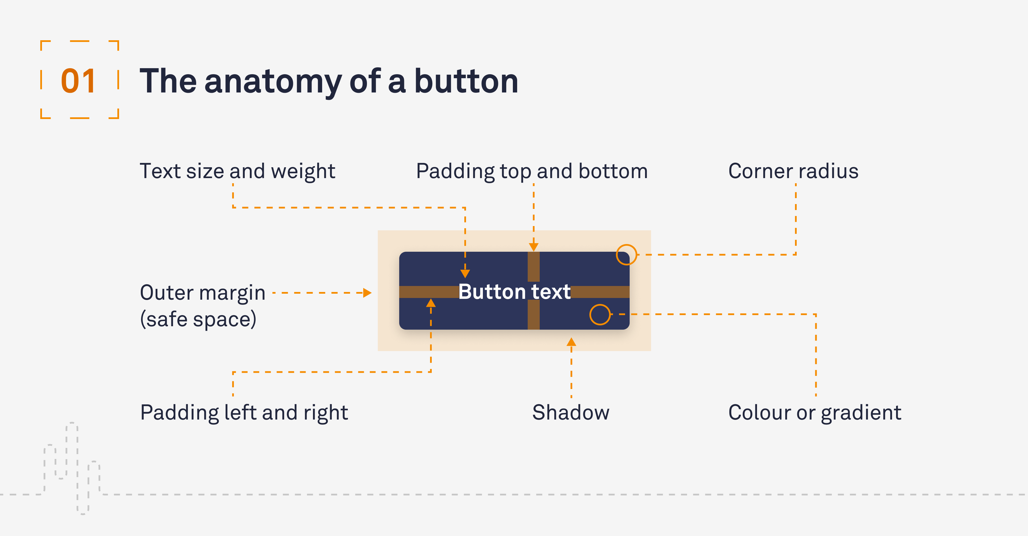
Button structure is centred around the following seven elements. From here, we can begin to start the process of creating our button:
- Corner radius
- Colour or gradient
- Padding left and right
- Padding top and bottom
- Outer margin (safe space)
- Text size and weight
- Shadow
Typically, a button is built around a short piece of copy (microcopy) which is then encased inside the button with padding left, right, top and bottom to establish hierarchy and contrast within the design. The button will normally have some form of corner radius. This represents the size of the rounded corners of the button shape. If you have a radius that is half the height of the button, your button will have a fully rounded edge.

2. Button types and states
User interfaces typically have two button types – primary and secondary – potentially with tertiary styles to suggest Calls to Action (CTAs). These button types will have interactive states. It’s important for accessibility that these are addressed, so users know how they are interacting with the interface. In particular, it’s important the focus state stands out as it’s used to support keyboard navigation. The states are:
- Default
- Hover
- Pressed
- Focused
- Disabled

3. Sizes and tap areas
Studies by the MIT Touch Lab suggest that 10mm × 10mm is the best minimum size for buttons on mobile due to the average size of fingertips. Below we have suggested door spacing and padding sizes.

4. Button microcopy
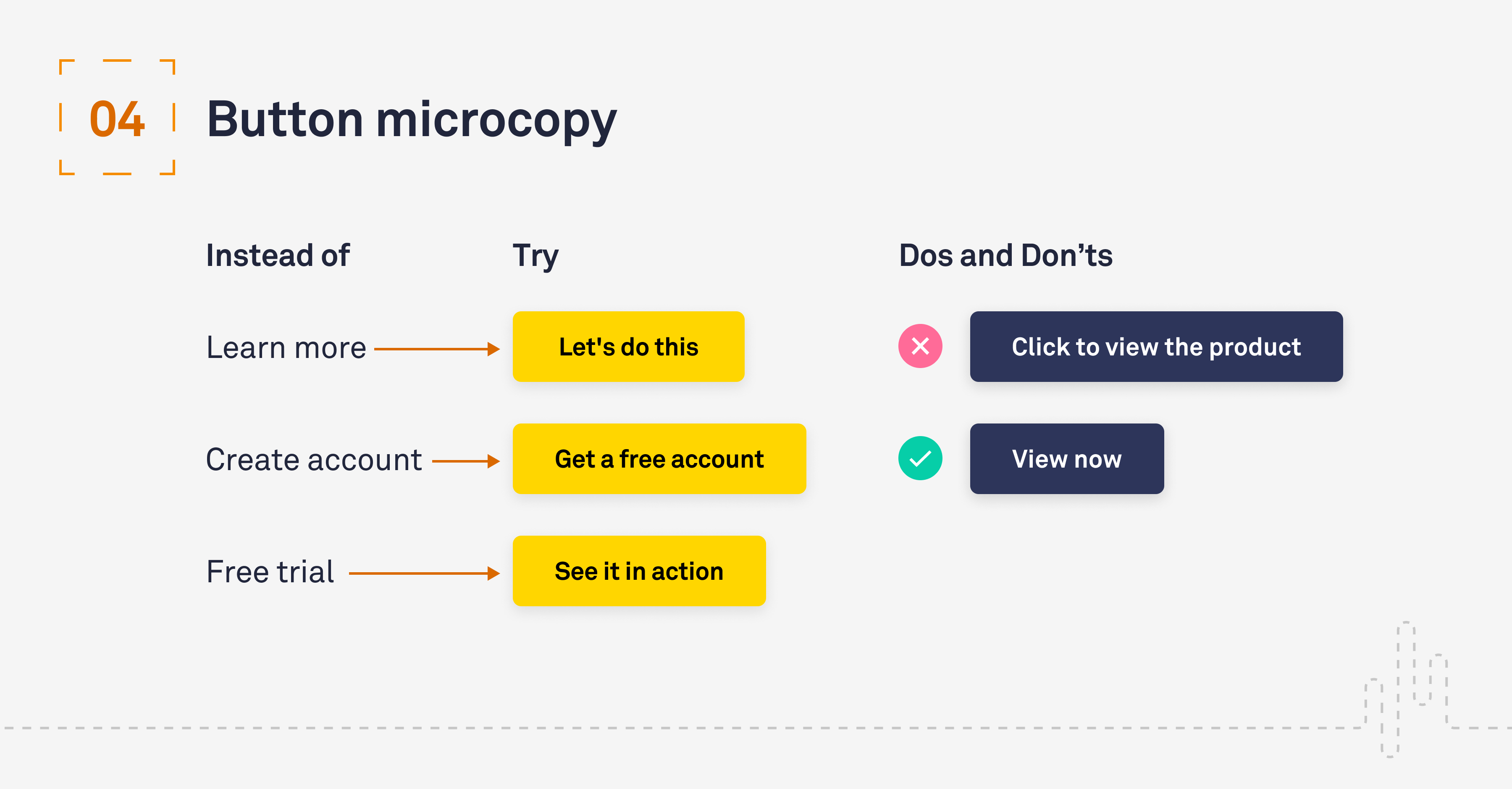
Button copy should be concise and clearly describe what the user can expect when they interact with it. However, that does not mean it can’t be fun – buttons can bring your website to life with human-like idioms! Keep your button copy to one line but have a play with the calls to action. Here are some examples:
- Instead of ‘Learn More’ try ‘Let’s Do This’
- Instead of ‘Create Account’ try ‘Get a free account’
- Instead of ‘Free Trial’ try ‘See it in action’

5. Colour
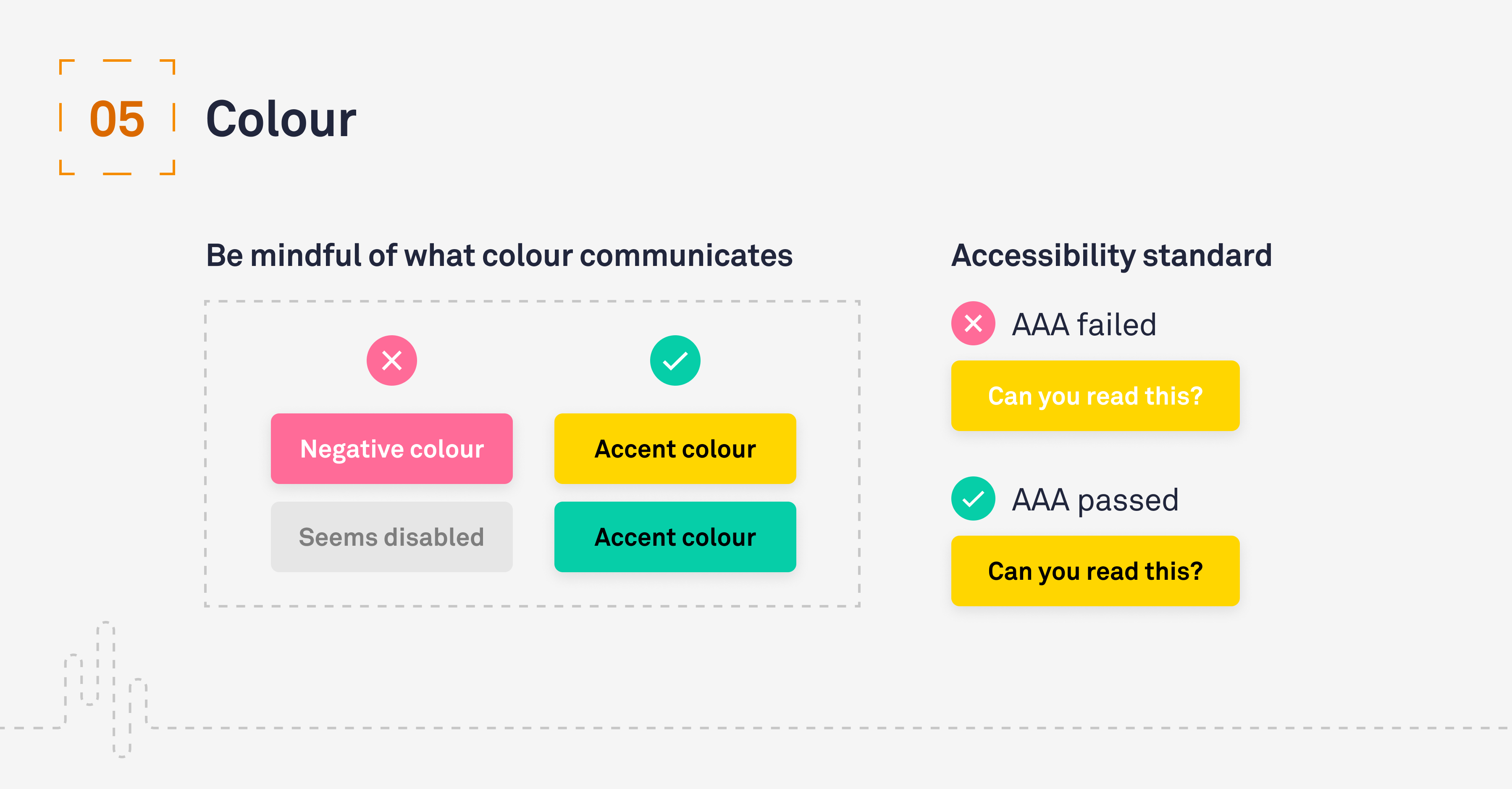
When selecting colours, it is critical to consider the context that people associate with each colour. For example, using red may communicate a negative action, such as reject, cancel or stop, while green often means the opposite – accept, continue or go. It is also very important to ensure there is enough contrast for the button text to be accessible. Make it Clear always aims for WCAG AAA (the best level of Web Content Accessibility Guidelines conformance) – there are plenty of checkers online that you can use to check this. Here is one we use.

Conclusion
Designing and creating buttons is an integral part of user interface design. It allows the user to navigate their way through digital platforms and accomplish their goals.
Poorly designed buttons can not only have an adverse effect in regard to the overall aesthetics of a platform, it can also lead to user confusion, inactivity and an increased bounce rate. A considered and clear button design is vital for creating a smooth digital journey and will help the user feel confident in their actions.
Why not get in touch
We’d love to talk to you about how Make it Clear can support your organisation. Do get in contact here.

