This article will outline the importance of typography while designing for the web. It focuses on the value of establishing a typography scale and developing the correct type size and weight, providing insight into how to accomplish this. It also discusses best practices for different elements in a typographic hierarchy and supplies some usability and hand-off reminders.
“95% of the information on the web is written language. It is only logical to say that a web designer should get good training in the main discipline of shaping written information, in other words: Typography.”
Oliver Reichenstein, 2006
By getting typography right, you are optimising the readability, accessibility, usability and the overall graphic balance.
“Typography in practice is not choosing fonts or making fonts, it’s about shaping text for optimal reading experience.”
Oliver Reichenstein, 2006
The importance of typography
The concept text as user interface was coined by Cameron Moll, which encourages designers not just to treat text as content, but treat it as a major part of the user interface. By starting with text – which will make up most of the website – and organising the grid around it, you can fully optimise readability.
Typography Scales
Introduction
Typography scales determine how much bigger or smaller the increments between fonts get in a typography design system.
They are useful for creating a balanced typography scale that stays consistent across different screen sizes, and this helps establish a consistent vertical rhythm.
Modular typography scale
In this approach, a base font size is chosen (typically the body text size), and then font sizes are calculated based on a specific multiplier. Websites like Modular Scale or Type Scale make calculations easier. There are pros and cons to this approach:
Pros:
- Consistent scale system with a consistent contrast
Cons:
- Multipliers often result in font sizes with multiple decimal points, which makes fast adjustments to type sizes complicated
8-point grid with 4-point baseline system
In the 8-point grid system, multiples of 8 are used to define dimensions, padding, and margin of elements. In addition, a 4-pt baseline grid is used for typography, where the focus is on line heights instead of exact font sizes.
Pros:
- Helps maintain vertical alignment across columns
- Makes calculations easier
Cons:
- In code, there is no underlying grid, so the coded results will slightly differ from designs – more on the usage of pixels in web design later in this article.
Tip:
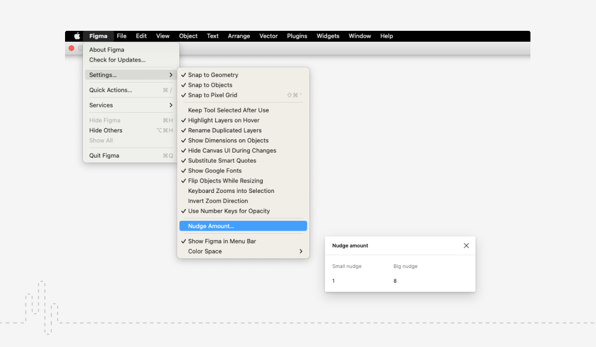
- Adjust big nudge settings to make designing to the grid easier.

Combining the two
When working in print design, to get the best of both worlds, pick a modular scale that suits your project by adjusting the results so they are multiples of 4 or 8. This will help typography styles stay consistent while keeping the numbers manageable.
Contrast
High, medium and low contrasts are each suitable for different types of designs. Refer to the examples below.
High Contrast Type Scales
Good to use for large screens, or more of a dramatic effect. Often used in marketing, and usually accompanied by lots of white space.
For example:
1.414 – Augmented Fourth
1.500 – Perfect Fifth
1.618 – Golden Ratio

Medium Contrast Type Scales
Most common and workable for most screen sizes. Works well for designs rich in text. Often used in editorial pieces, or where a large amount of information is conveyed. Spacing here is less dramatic, but optimised for the ideal reading experience.
For example:
1.200 – Minor Third
1.250 – Major Third
1.333 – Perfect Fourth

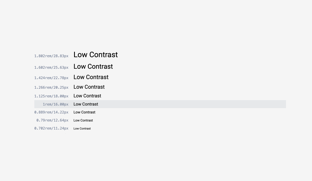
Low Contrast Type Scales
Works well for data-based projects. For example, dashboard-based apps, e-commerce listings, filing taxes, or visualising performance metrics. Spacing is much tighter to accommodate large amounts of data that need to be presented together.
For example:
1.067 – Minor Second
1.125 – Major Second

Naming system approaches
There are a couple of different approaches to naming typography styles. See the suggestions below to compare different options.
Names corresponding to HTML tags
Example: caption, paragraph, body, h1, h2,…
Pros:
- Makes development faster and easier by speaking directly to developers.
Cons:
- Each style needs to have a few options for use on different screen sizes.
Sized-based naming system
Example: XS, XS, S, M, L, XL, XL
Pros:
- Makes responsive typography easier – all styles can degrade one step on tablet and again on mobile.
Cons:
- It not being clear where to use each style from the name can result in inconsistencies.
Descriptive or functional naming system
Example: alert, modal-header, button-label
Pros:
- Helps communicate where the style is used, especially to developers.
Cons:
- It can result in too many styles.
Coding implications
In HTML and CSS terms, H1-H6 will always be used. This doesn’t have to affect how headers are named in typography style guides for designers, but they always have to be taken into account as they affect the development.
Measurement units
Picking the right measurement unit will have implications for developing other parts of the design, including padding and margins. When creating designs where responsivity doesn’t need to be taken into account, absolute units (pixels) are easier to manage. However, when dealing with issues of responsivity and accessibility, fluid measurement units like ems or rems will be preferred by developers and users alike.
px (pixels)
An absolute size based on the pixel size of the user’s screen. Most web browsers are equipped to make the design look similar across different resolutions even when using pixels.
Despite the restraining implication in a web environment as well as developers preferring em/rems, most design software works primarily in pixels, making it an easy default choice for designers.
Em
Ems are relative to their parents, elements on which the fonts are being used. This is usually the browser settings and can be overridden in HTML. In addition, each element nested within can have a different setting, which can get quite complicated (example).
This means that 1 em can translate into 16px, 160px, or any other value depending on the element (Browser default, HTML or any other element with specified font size). From there, the sizes are multiplied.
So, if the base size (1 em) is 16px, 10em would be 160px.
Rem
To prevent the issue of each nested element having different settings, it’s best to use Rem instead of Em.
Rem, standing for “root em”, only takes its values from the browser settings or the HTML if those values are overridden.
Base size – using default values vs. overriding them
By default, the base size is inherited from the browser. The default setting is 16px, but this can be changed by the user in browser settings to anywhere from 9px to 72px. By overriding the base size in HTML, you can achieve a desired look, but accessibility will suffer by taking away customisation power from the user.
To preserve the user’s customisation settings while adjusting the base size, stick to em or rem measurements. By doing this, the browser setting will be multiplied by your chosen value. So, if you want the base size to be 18px instead of 16px, set the base size to 1.125 rem or em (16 x 1.125 = 18). As a result, the base size will be displayed as 18px for most users, while it can still be customised by users that need it.
Advantages of using em or rem
This system gives the ability to scale elements up and down instead of sticking to fixed sizes. This helps with adjusting designs during development and makes designs more responsive and accessible by allowing users to change the overall scale of their browser for best readability.
Setting padding and margins in em measurements helps the ratio stay consistent in relation to the text. See here for an example.
Changing from px to em/rem
Converting from an existing pixel scale to an em/rem scale can seem daunting, but can be handled with a simple calculation. This article explains how to do that.
Hierarchy
Headlines
The role of headings is to make it easier for people to navigate a page by visually separating a page into clearly defined sections and easing scanning.
Font choice
Use sans serif or serif fonts. Or, to help attract the eye and add visual value, choose an expressive font that compliments the body text.

Hierarchy system
Don’t skip elements – on any given page, only increase or decrease by one heading size at a time (don’t jump from a H2 to a H4).
H1
Only have one H1 per page; they establish the top-level hierarchy.
Don’t use for headings that do not change between pages (site’s name).
Only having one H1 per page and using keywords in H1s used to be one of the main requirements for SEO optimisation, but it has become less important as search engines become more advanced. For Google, H1s are useful but not critical.
Subtitles
Subtitles are smaller than headlines and are used for shorter text of medium emphasis.
Font choice
Do: Use sans serif or serif fonts.
Don’t: Use expressive fonts, including display, handwritten, and script styles.
Body
Core text style used for long-form writing.
Font choice
Do: Use sans serif or serif fonts.
Don’t: Use expressive fonts, including display, handwritten, and script styles.
Naming
Consider using numbers (body 1, body 2) or t-shirt sizes (small, medium, large).

Size
For most systems, the default should be 16px, but it is possible to go down to 14px when designing very dense and information-heavy pages.
Keep in mind that font size can slightly change depending on the font.
Variants & number of sizes
Most systems need 2-3 different text sizes, so start with a few and expand if necessary. Create changeable properties (size, weight, line-height), which will serve as variants to existing styles. If your design includes articles or similar pages, create a “lead” variant.
Variants should be created in addition to each existing body text size to aid responsivity.

Caption and overline
Caption and overline text (text with a line above it) are the smallest font sizes.
Font choice
Do: Use sans serif or serif fonts.
Don’t: Use expressive fonts, including display, handwritten, and script styles.
Button
The text on a button combined with the look of the button itself is used to indicate that something will happen once the button is clicked. It is important to make the button text appear distinct from non-interactive text to prevent confusing users.
Font choice
Both sans serif and serif fonts can be used. Don’t use expressive fonts, including display, handwritten, and script styles.
Use sentence case or capital letters to signify higher importance.

Suggested process when creating a typography scale
- Decide on base size (body text size)
- Approximately define H1
- Determine how many headers are needed based on your product. This shouldn’t exceed 6.
- Experiment with applying type scales (using a website like Modular Scale or Type Scale), and select the most appropriate one for the product. Refer to the contrast scales earlier in this article. Keep in mind that hierarchy can also be established using different font weights and cases.
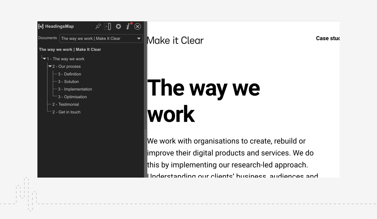
- Create an outline to apply the type system. This helps headlines follow a logical sequence and is critical for accessibility; screen-readers need them to jump between content. An extension like HeadingsMap can be used to check headings structures on websites.

Usability reminders
Some common mistakes that affect usability are:
- Text vs. background colour contrast (Use websites like WebAIM to compare)
- Text blocks which are not split up into digestible chunks
- Not enough white space
- No differentiation between visited and non-visited links
- Line length too long (In general this is 45–75 characters including spaces)
- Alignment issues
- Pictures disrupting reading ease
Handoff reminders
Fall back fonts
Nominate common fall-back fonts in case the chosen fonts don’t load on the user’s devices. Arial and Times are popular choices.
Through CSS, font families are designated in ranking order called a “font stack”. So, in theory, multiple fall back fonts could be nominated.

Access to fonts
The typography style guide needs to provide download links or access links to fonts.

What to include
In addition to the type scale, also include details like responsiveness guidelines, colour and any other suitable information in your typography guide.
With colour, it is good practice to identify the primary (most text) and secondary (supplemental information) colours, as well as colours used in specific situations – interactive (links, buttons, tab labels), disabled (inactive or disabled links) and error (will have the highest contrast with its surroundings to stand out).
To conclude
For designers, choosing pixel values based on intuition to define a typography system can seem like a given. This can work well in print settings, but things get more complicated on the web. It is important to consider the implications of using pixels on accessibility and responsivity as well as the development side of things. In print and web design alike, using a typography scale and focusing on clearly defining when each style is used can greatly improve the consistency and vertical rhythm of your designs.
Book a call
We’d love to talk to you about how Make it Clear can support your organisation. Book a call here.

