UI UX Design systems
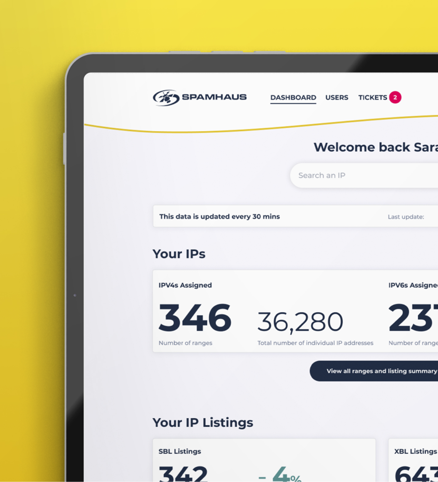
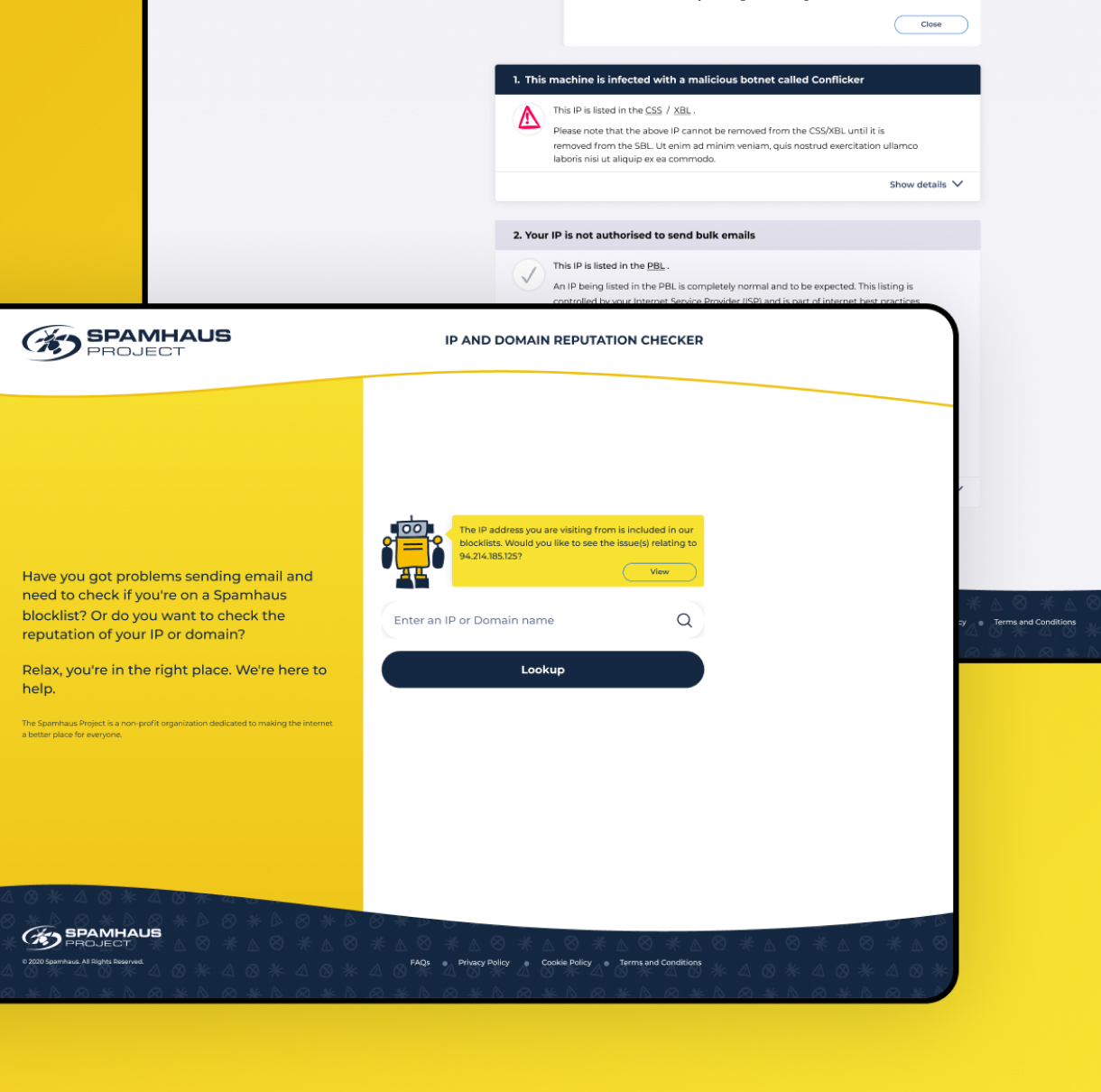
A design system is a collection of reusable components that underpin your digital visual language. For organisations supporting multiple digital offerings, having a design system is crucial for visual consistency and future development. Our experienced team will identify the elements that are required for your organisation to form its foundations before creating your design system using an online tool that allows access from multiple teams.
Who is it for: Companies with existing products or those planning a rebuild
Impact: With a design system in place, you are ensuring the quality of both experience and brand representation
How long does it take: 2 – 3 months
What is a design system?
A design system supports designing at scale in a standardised manner. It typically contains reusable components, patterns and associated principles. Components are often parts of an interface that can be logically grouped together into a singular element, for example, you may have a navigation bar component. Patterns are typically elements such as typography and buttons – repeatable elements that form the building blocks of an interface. Finally, the principles outlined create practices for when and how these should be implemented.
Impact


Our UI/UX design systems process
Acquire insight
We begin by auditing your existing materials such as: documenting interface components, brand values, style guides, pattern libraries and templates. Depending on the scale of your organisation, we will advise whether this is best accomplished in stages. All of these resources will then be reviewed, where inconsistencies, variations and gaps will be identified.
System definition
Working collaboratively with you, we define the principles and pages to be initially included in your design system. As design systems should be treated as a living resource, this work may also include creating a roadmap for continued development. The final step is creating the values and principles (style guide) and set of building blocks alongside instructions (pattern library) to make up your design system.
Review and iterate
To sustain effectiveness, design systems should continue to grow and be consistently maintained. At Make It Clear we can discuss providing additional consultancy services to co-own your design system, enabling us to continue to build and maintain the design system for your organisation. Book a call for more information.
FAQs
What is the purpose of a design system?
Design systems support the development of digital products at scale. They contain reusable components, patterns and associated principles that can support growth and future implementations of designs.
Having a design system also means a single source of truth and facilitates a common design language across teams. This creates alignment between designers, developers, content producers and other stakeholders, making it easier for them to do their jobs.
Why do we need a design system?
A design system can be useful for all teams within your organisation, but most specifically, those which are involved with the interface. The design system will support teams to improve or update your products using standardised components as well as ensure your messaging and assets are on brand.
Benefits of a UI/UX design system
Conducting this work can provide a number of benefits to support the ongoing development of your product family. Three key benefits include:
- A unified and consistent branded experience
- Streamlined design and development process
- Designs can be made more readily at scale
When should we create a design system?
A design system can be created at any time however we recommend creating this alongside a project to maximise the opportunity to implement and align design principles and components.
What's included in our UI/UX design systems package?
We first work with you to gather all existing materials, such as documenting interface components, brand values, style guides, pattern libraries and templates. We then review and audit these to identify variations, inconsistencies and gaps.
Finally, we define the principles and pages to be initially included in your design system, which will form its foundations going forwards and support its continual growth.