
Looking ahead to what’s coming up next in the world of design is one of the best things about the start of a new year. We do so by examining logo design trends that are gaining traction and poised to take over in the coming year.
Communicating social identity
We are visual linguists as logo designers. We develop communication shortcuts. You are absorbing information through various channels, you can determine if someone is excited, sarcastic, emotional or any other tone by their expression, body language or even the inflexion in their voice. The reliance on symbols in society and our capacity to use them effectively in communication is a relatively new phenomena.
Consider this: during the previous ten years, Google has generated around 2000 pictograms known as material icons to act as interface concepts. You have over 3000 recognised emojis at your disposal on your personal device and none of these were available even a generation ago.
We now know that a string of ellipses indicates that someone is attempting to communicate with us. A cart does not indicate that we are at the grocery store and looking for bars does not indicate that we are thirsty. Because of the rapidity with which symbols are gaining meaning and acceptance, we as designers must be very aware of and alert in monitoring current trends.

We need to grasp what a gradient means, as well as the public’s perception of transparency. We must also comprehend the ideogrammatic language which expresses concepts and ideas universally without the use of words or phrases. Designers have grown alongside our visual culture, successful marks have relevance. Evolution is not in trend. Evolution is a trend.
It’s always good to remember that our profession is founded on symbolism. We create symbols to represent something or somethings that express an idea or essence that best represents our clients. The panoply of hearts, crosses, hashtags and Wi-Fi lines gets tooled and retooled into many versions, even mashed up with other symbols because they already have meaning that doesn’t need to be re-explained to the audience. However, it is important to remember that symbols are living entities. They are constantly roiled by evolution. This is why a trend report like this is so crucial in calling out or addressing the trajectory of imagery and noting somewhat undetectable shifts that become much more apparent in subsequent chapters.
1. Retro rubber hose logos
You’ve seen images of rubber hoses, they have been a staple of design, especially animation seen in 1920s or 1930s cartoons. In 2022, we’ll be seeing a lot more of them, especially in logos. The style lends itself to characters, and character logos are a way for brands to feel more approachable and real.
2022’s rubber hose logos are colourful, a welcome change from yesterday’s black and white cartoons as designers can add brand palettes and make this style appear fresh and modern by presenting these characters in colour. They’re also almost always non-human figures, which gives them a whimsical and playful feel.
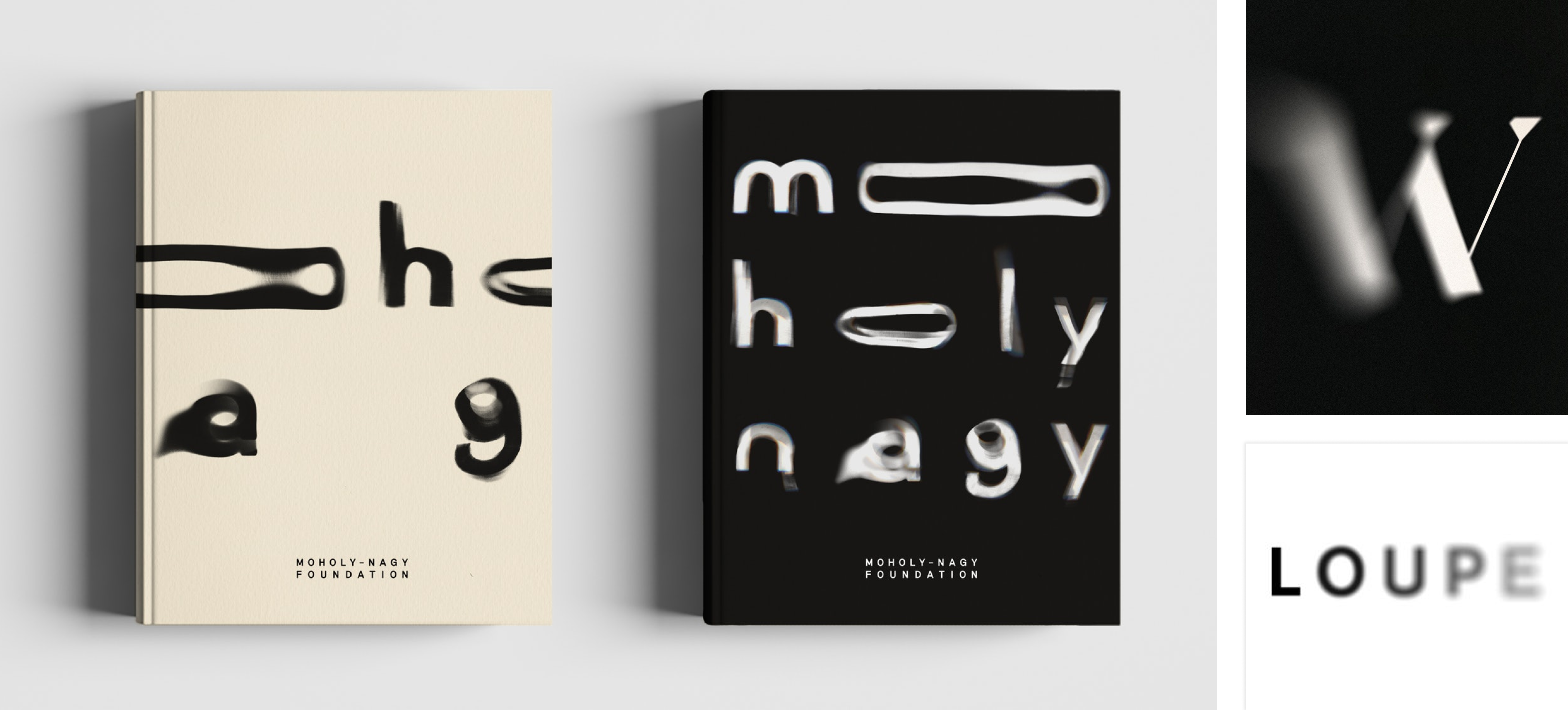
2. Blurred logos
Legible logo designs will become less of a priority in 2022 as designers experiment with blur effects to highlight fluidity and movement rather than readability. Making use of a stylistic blur can be achieved in two ways, the first by blurring the borders of characters, leaving the main body of the word visible. The second would be to pair the blur logo with a clearly printed version of the brand name to provide the reader with more visual cues of the brand identity. Adding a blur effect to a logo is both captivating and memorable as well as welcomes the addition of animation.
3. Stretched and continuous lettering
Blur won’t be the only distortion applied to logos in 2022 as designers are also experimenting with extended and continuous letters for a limitless, boundless appearance and sensation. These logos have curves, with some giving the impression of spaghetti strands wanting to be twirled around a fork. Others expand simply one or two letters while the rest of the text stays regular-sized, drawing the viewer’s attention to the stretched characters for emphasis.
When a logo emphasises one letter by stretching or distorting it, the pronunciation of the logo title frequently gives vocal emphasis on the same letter or sound. Alternatively, you might distort letters in a logo to represent the principal product or service of the brand.


4. Neon vision and holographic logos
Neon and holographic logos strike the viewer with vivid colour gradients to make a vibrant impression which is ideal for dark backgrounds and futuristic designs. While Art Deco is making a comeback with clean and elegant geometry, Neon is all about bringing back the 80s synthwave and making it shine in the dark.
The colourful gradients give the impression of perpetual motion and add a dynamic element to the logo design. It has become the preferred method for technology-related logos.


5. Scribbles and sketches
While some designers play on simpler times in their designs by adding motifs from previous decades, others take a different approach to nostalgia: wobbly, scribbly, childish artwork.
Expect to see more scribbles and use of a rough, unfinished style, as opposed to the smoother, more “manufactured” designs you’ve seen in recent years. This style is raw, yet refined and straightforward.

6. Experimenting with line thickness
Expect to see a lot of logos with varied line widths in 2022. Designers are experimenting with balancing in order to bring depth and complexity to their designs. Consider the following:
- These logos have a dynamic flair that matches our dynamic, forward-thinking vision for the 2020s and beyond.
- Letters, at least in fonts, are generally either thin or thick; when they aren’t, their weight fluctuates in logical places. Designers are breaking old norms and experimenting with lines, strokes, and shapes that don’t feel confined as they push limits and continue to innovate through their designs.
Perhaps this is a reaction to how limited many of us have felt in the last two years or so, or it could be that because 2022’s logo design trends are so font-heavy, designers are naturally looking for ways to play with words.

7. White space finds imagery
White space, often known as negative space, is frequently just blank. That open space can be used for a variety of purposes, including creating “context” for the logo’s focal point and balancing its composition to avoid appearing cluttered. Blank space, on the other hand, expresses a brand value such as directness or openness. However, in 2022, we’ll see more logo designers dealing with blank space in novel ways: considering it as a blank canvas to fill in various ways depending on where and how the logo is utilised.
This type of logo is quite versatile, which is why it appeals to a wide range of businesses. When you need to change the look of your logo from website to print, or from winter to summer, or even from edition to edition—a logo with configurable white space is simple to adapt to varied needs without really changing it.


8. A groovy revival
Logos seeking visual cues from the groovy 70s are a recurring subject in logo design trends year after year. This trend is nostalgic while yet being futuristic, kitsch while also being slick. Fonts melt into curving letterforms or bubble up into softie styles, while bright, garish colours clash with basic layouts.
Many people today associate the 70s with inclusive views and optimism for a peaceful future, whether they lived through them or not.


9. Layered elements
Logos with layered elements are another major logo design style that will emerge in 2022. Designers are experimenting with geometric shapes, fonts and colour combinations to create classic logos with a modern twist. Legibility is taking a second seat to looks in many of 2022’s logo designs, as we witnessed with blurred logos and with these layered logos, we’re seeing sudden colour and pattern shifts “disrupt” text and visually separate parts within a design.

10. Typography takes shape
Once again, wordmark logos take centre stage, with the writing of the logos communicating the brand personality. These logos are classified into two types: those in which the text dominates the imagery, creating an emblem-like shape for the logo, and those in which the typography is nestled inside the artwork, providing structure and shape. In these logos, we see text and images working in tandem. They aren’t like logos where the title is printed apart from the image; in these cases, the text is critical to comprehending the graphic.
11. Grunge gets a revamp
We’ve just seen how 2022 logo design trends pay homage to ’30s animation, ’70s groovy optimism and ’00s maximalism. However, these aren’t the only decades whose aesthetics are being highlighted this year. Designers are also paying homage to the 1990s with grunge-inspired creations.
Consider lo-fi and adolescent versions of current technologies. Consider dark and sombre with a DIY vibe. That’s grunge style in action. With these logos, you can see a bigger trend at work: wordmark logos in which the typeface is the primary feature. These typefaces have a rough texture.
12. Gradients
Gradients aren’t new this year, they’ve been making a comeback for quite some time and aren’t going away anytime soon. This tendency has persisted in all areas of digital design, from website backgrounds to overlays and, of course, logos.
A gradient is a graphic element generated when colours progressively fade into one another. Gradients can be monochrome or have several colours or tints mixing together. An excellent gradient design, regardless of the colours used, must appear unified and fluid. Incorporating gradients into a logo offers depth and dimension, it is the polar opposite of flat logo design (which remains trendy this year).
Incorporating brand colours into a gradient is a quick and easy approach to improve the look of a logo. The secret to successful logo design is it should appear nice at any size and in every setting. Gradients can be tough at times, make sure to use it in a balanced way.
For example, when using a gradient, utilise it sparingly and only on a portion of the overall design. Create a harmonic juxtaposition, pair a gradient icon with a clean, simple geometric typography.

13. Organised chaos
There has been a sharp rise of the “organised chaos” design trend. Organised chaos is a free ideal that mixes simplicity and mayhem. It is rooted in anti-establishment protest and affirmation of the “ugly.” It’s breaking the rules, on purpose.
This logo design concept can be seen with delicate and understated attributes. Using several of the trends on our list such as experimental typography, layering and monochromatic colour palettes, in one unified logo design. Asymmetrical shapes, negative space and strange symbols are also used in novel and edgy ways.

Final thoughts
Breaking compositional rules doesn’t have to mean going completely rogue. Choose one part of a logo design and make it the focal point. For example, if the logo is a wordmark of a company name, make one letter stand out by reducing its size or moving it outside the composition’s imaginary grid. Using a unique approach will allow your brand to stand out from the rest.
Have a call
We’d love to talk to you about how Make it Clear can support your organisation. Book a call here.
