Jakob Nielsen’s article “Enhancing the Explanatory Power of Usability Heuristics” written in 1994 outlined a set of seven heuristic principles for evaluating user interfaces and to discover any usability problems.
Over time this list has expanded to include ten key usability heuristics which user experience and interface designers reference, and adhere to, when creating easy to use and engaging digital experiences and interfaces. The following article will address what those principles are, why they are important and how they work in practice.
1. Visibility of system status
The visibility of system statuses is not only confined to the digital world, but is ubiquitous to our everyday life experiences. Every time you look at a sign in the supermarket or see a road map on a roundabout you are digesting signifiers that have been created to improve your experience.
Clarity, control and a clear understanding of a system’s current state will leave users feeling content and in control of their digital experience. This can be achieved by creating predictable interactions and clear signifiers such as icons, hover states and progress indicators. Presenting immediate feedback and continuous communication are key components for creating trust and clarity for the user.

2. Match between system and the real world
To create an intuitive and easy to understand digital experience it’s essential to use language, imagery and icons that are clear and understandable to your users. Designers must tailor their design language to their prospective audience. Just because you understand what a certain image means, it doesn’t automatically follow that your users will. Using universally understood graphics and colours will help create an intuitive user interface.
Taking this theory to the extreme is ‘Skeuomorph’, an intentionally pixelated graphic that retains its visual cues and details that existed in the original design. An example of this can be seen with the first Apple iPhone icons; these icons mirrored their real-life counterparts to help users intuitively learn and understand what each icon represented.

3. User control and freedom
Not being able to return or undo an action can leave users feeling frustrated and exasperated. Constructing clearly defined actions and exits from unwanted scenarios is vital when creating a clear and easy-to-understand digital journey. It leaves the user with a sense of freedom.
Icons or language used to create this sense of control are most effective in their most basic form. Signifiers such as a back arrow, “Undo” or “Redo” as well as having a clearly discoverable exit label are best practice. These examples allow the user to clearly and easily undo any mistakes and revert back to their previous “happy” place.

4. Consistency and standards
The use of consistent language, both visually and grammatically, as well as design principles that are in line with other popular digital platforms, will help create an easy to navigate and intuitive experience.
Using terminology or asking the user to perform actions that are uncommon or foreign in comparison to other popular platforms will have an adverse effect on discovery and task completion.
Consistency can be achieved by creating a set of design principles and language that are consistently used within your design team. Such principles should be inspired by best practices from respected platforms and established industry standards. Examples of these include the Carbon design system and Adobe spectrum https://carbondesignsystem.com/ https://spectrum.adobe.com/. For digital products this often takes the form of a style guide or design system, a tool used internally to inform all design decisions which maintains visual consistency throughout.

5. Error prevention
Preventing errors or mistakes by the user is one of the most important aspects of any product, whether that be physical or digital. Creating a product that is intuitive to use and minimises user errors is essential when creating delightful user experiences.
“Good error messages are important, but the best designs carefully prevent problems from occurring in the first place. Either eliminate error-prone conditions, or check for them and present users with a confirmation option before they commit to the action.”
There are two types of errors: slips and mistakes.
Slips are when a user unintentionally performs an erroneous action due to inattention. It is important to prioritise your time and effort, focusing on preventing the most serious mistakes. One technique that can help with such organisation is a prioritisation matrix. A prioritisation matrix allows you to categorise and sort tasks by their impact and importance versus the effort required for design and implementation.
Mistakes, in contrast, are a conscious error by the user induced by poor user experience design. These occur when a user’s mental model of how a system should work differs to the reality of that model. In layman’s terms, the user takes the wrong action because they misunderstood the platform’s functionality or signposting. Create and implement a mature design system and signposting to help prevent user mistakes.
6. Recognition rather than recall
Recognition is when the user easily recognises an image or component through familiarity. Recall, in contrast, is when the user has to remember information from one screen to the next. Reducing cognitive workload will help create a smoother user journey.
Incorporating easily recognisable and commonly used images and components into the user interface design will allow for a quicker and easier user experience. Reducing the amount of information a user has to remember, and providing context and tooltips, will help facilitate this.

7. Flexibility and efficacy of use
Tailoring the user interface design to your users’ needs is vital when creating a positive user experience. Creating minimalist designs will allow the user to navigate their way around the site or platform more easily, while creating shortcuts and advanced options for experienced users will allow for a quicker and more seamless user experience.
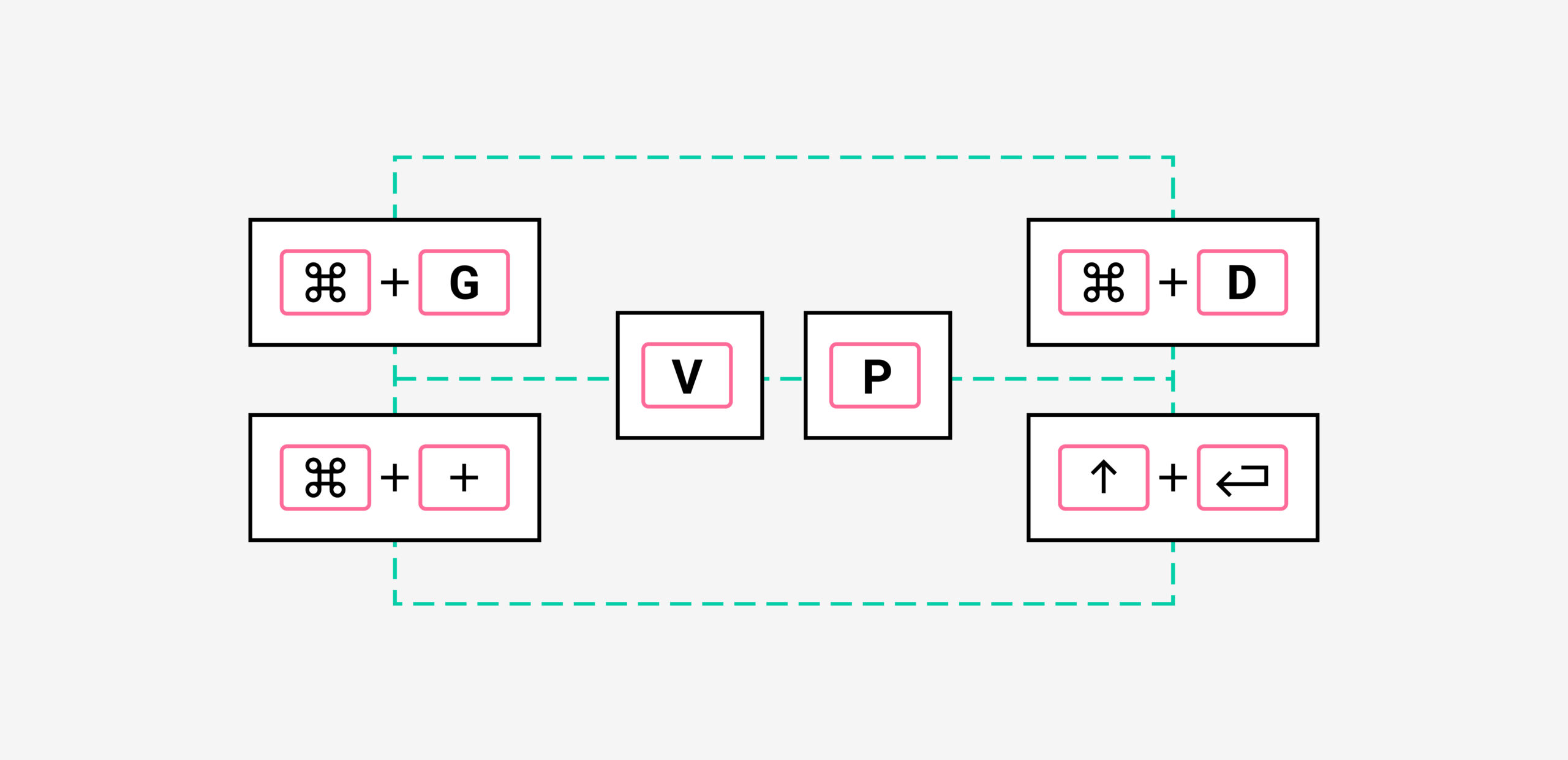
As outlined above, the use of shortcuts available on Adobe programs and other design tools such as Figma are a good example of this principle. Experienced users use shortcuts to reduce the time navigating their way around the screen and the number of clicks taken, thus allowing them to create designs more efficiently.

8. Aesthetic and minimalist design
A considered aesthetic means every design decision is well thought through and has tangible meaning. Minimal design removes excess and clutter. The two combined ensures key content and functionality are championed, allowing for a seamless user experience.
Considered use of white space, page real estate and proportions of objects and components will result in an elegant and sophisticated design.

9. Help users recognise, diagnose and recover from errors
Errors or mistakes made by the user can lead to frustration, annoyance and drop off, therefore clearly communicating when an error has been made and providing a solution are essential tools when designing digital products.
A three-step process should be implemented to ease such frustrations during the design process:
Inform the user when and where the error has occurred; both colour and language can be used as an indicator.
Communicate to the user what the error is and how it has been caused, using easy to understand language.
Answer the user’s error and offer a solution. This can be done by providing a link, set of instructions or tooltip.

10. Help and documentation
It is inevitable there will be some confusion for users (particularly new users) when interacting with digital products, especially when using complicated platforms or navigating detailed data sets. It’s important to provide help with functionalities and documentation to facilitate greater clarity and explanation of how to use and read such products.
Providing easy to understand and discoverable documentation in the right context, as well as comprehensive answers and solutions to all possible queries, will help alleviate any queries and confusion users may have.

Conclusion
In conclusion, having a solid understanding and consideration of the outlined heuristic principles will stand any user experience and interface designer in good stead when creating digital products, putting the users’ wants and needs at the heart of all design decisions.
Have a call
We’d love to talk to you about how Make it Clear can support your organisation. Book a call here.
