Search inputs are an essential element to your website as they are often the first place users visit. Ensuring you have effective and efficient search inputs can improve conversion rates by 2-3 times. We’ve outlined our key principles for creating best-in-class search input boxes below:
For more information on other terms, please see our UX glossary.
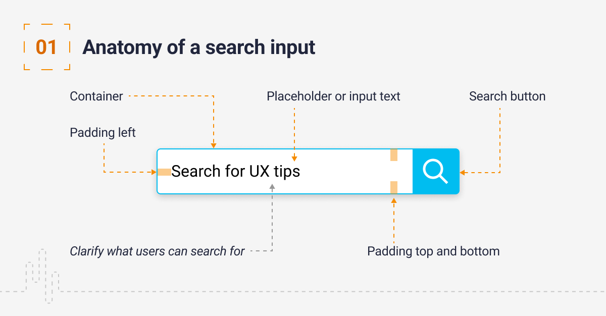
1. Anatomy of a search input
A search input consists of numerous fields which allow you to collect data that is input from your users. You will typically find:
- Container: the bounding area of the form field
- Placeholder/Input text: text that is used to help the user before actual text is input
- Search button
- Padding top and bottom
- Padding left
Some considerations when building your inputs:
Clarify what users can search for: Your placeholder text should indicate what a user can search for. This will help manage their expectations for the results they will be presented with. Try and condense this message into a few words.
Consider the field size: Make the search field long enough for users to add in an appropriate amount of information or data and keep this visible. If you’re short of space you can add a mechanism where the box expands when selected.

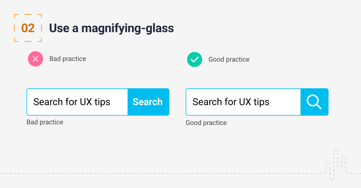
2. Use a magnifying glass
You should always support a search box with a magnifying glass. The magnifying glass is a universally recognised sign for search and users will seek this out. Don’t overcomplicate the design as users will take longer to interpret the icon.
Using the magnifying glass alone makes it much harder to locate the search. It also provides an additional click before users can input their query.

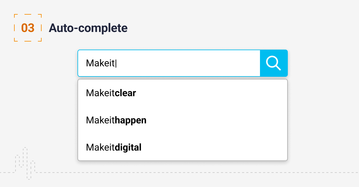
3. Auto-complete
Auto-complete is a powerful tool that will support your users by guiding them on what they can search for. As you type into the search box, it tries to predict your query based on the characters you have entered. By providing options you can save your users’ time and clicks as well as supporting correct spelling and data entries.
Prefix matching is the most common type of auto-complete, where the search input matches the initial characters of the term. You can also use infix (intra-word) matching where the match could be anywhere in the search string.
It is also possible to provide users with actual results. This is a technique utilised by e-commerce sites when actual purchase options appear as you type. A few points to consider when implementing auto-complete:
- Style the data accordingly – make it clear how the data input matches the presented results
- Make sure you support keyboard navigation
- Consider how to break down the information returned and style this appropriately; for example, you may want to display recent searches and prefix matching

4. Autocorrect
Autocorrect is a data validation tool that corrects the user’s input with the most probable match. It saves time and supports accessibility by supporting users that are dyslexic or have issues with spelling. I am dyslexic and often use autocorrect when typical spell checkers are unable to pick up certain mistakes. This is no accident – Google has a huge virtual dictionary consisting of all the words that people type while searching online, and it is constantly learning.

5. Location of the search bar
A study by A. Dawn Shaikh and Keisi Lenz with 143 participants found that participants expect to see the search bar at the top right or just generally at the top of the page. Wherever you place it, keep it obvious and consistently place it in the same location on all of your pages.

Conclusion
As UX evolves, you should consider incorporating new mechanisms such as voice commands. Put your user first when implementing search on your pages by considering what they are looking for and how you can make the experience as seamless as possible. Our job is to get the user to the right content as soon as possible.
Have a call
We’d love to talk to you about how Make it Clear can support your organisation. Book a call here.
